Samsung has begun seeding the Android 13/One UI 5 update, starting with the flagships in the Galaxy S series and its latest foldable phones. The update brings all the Android 13-centric bells and whistles to the table, but the changelog courtesy of Samsung’s own UI tweaks is massive.
From deep Material You theming and the ability to set custom call backgrounds for each contact to a unified app privacy dashboard and a supercharged routines system, One UI 5 is one of the most exhaustive functional upgrades Samsung has delivered in years. Below, I am going to highlight the five most useful features that have really improved my experience of using the Galaxy S22 Ultra on a daily basis.
By far, the best gesture system on a phone

One of the most meaningful changes with One UI 5 is the vastly upgraded gesture navigation system. For power users who love split-screen multitasking or working across multiple app windows, the new gestures are a godsend.
Launching the split-screen mode is now a cakewalk. A two-finger swipe-up gesture from the bottom of the screen instantly puts the foreground app in split-screen mode and pushes it into the top half, while the bottom half of the screen brings a list of app icons. Just tap on the desired app, and it will open in the bottom half of the screen.
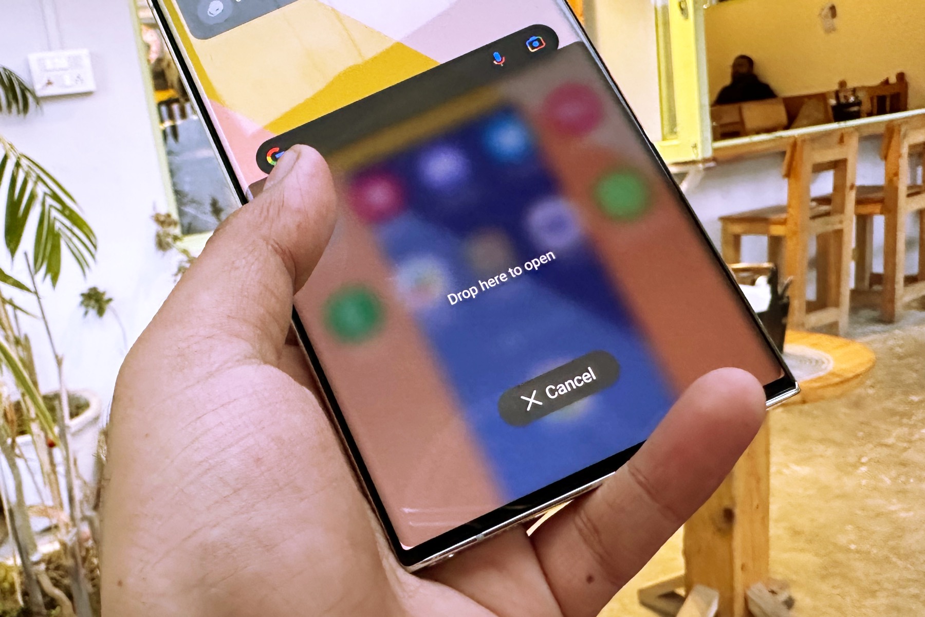
You can also launch into split-screen mode right from the recent screen. Long press on an app’s card in the multitasking view and drag it to either half of the screen. This way, you have more control over which half of the screen you want an app to occupy in split-view mode.

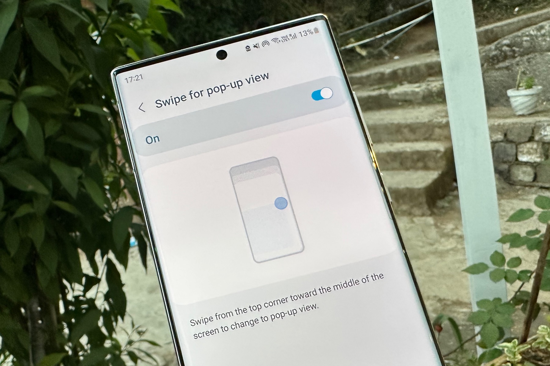
In order to launch an app in pop-up windows mode, you just have to swipe toward the center from either top corner of the screen.
The best part is that you don’t have to make window size adjustments, as that happens simultaneously without having to lift your fingers. The deeper you drag, the smaller the window will be, and vice versa.
Of course, you can also adjust the window transparency if things get too crowded on the screen, but you still want to keep an eye on the app running in the pop-up window mode. If you select an app’s card in the recent menu view and drag it to the center of the screen, it opens in a pop-up window right at the center. The gesture versatility here is miles ahead of what Apple has to offer with iPadOS or iOS.
One UI 5’s gesture overhaul is a serious productivity boost, particularly for the tiny screen of a phone. I absolutely love how effortless the whole process is, and if you’re working with a tablet like the Galaxy Tab S8, the benefits become even more apparent on the larger screen.
Extracting text from images, smartly!

Ever since Samsung first highlighted the key features of One UI 5, a lot of questions were asked regarding its similarities with iOS 15. Take, for example, the new scan and extract feature, which is essentially how the feature works on iPhones since it first arrived with iOS 15 last year.
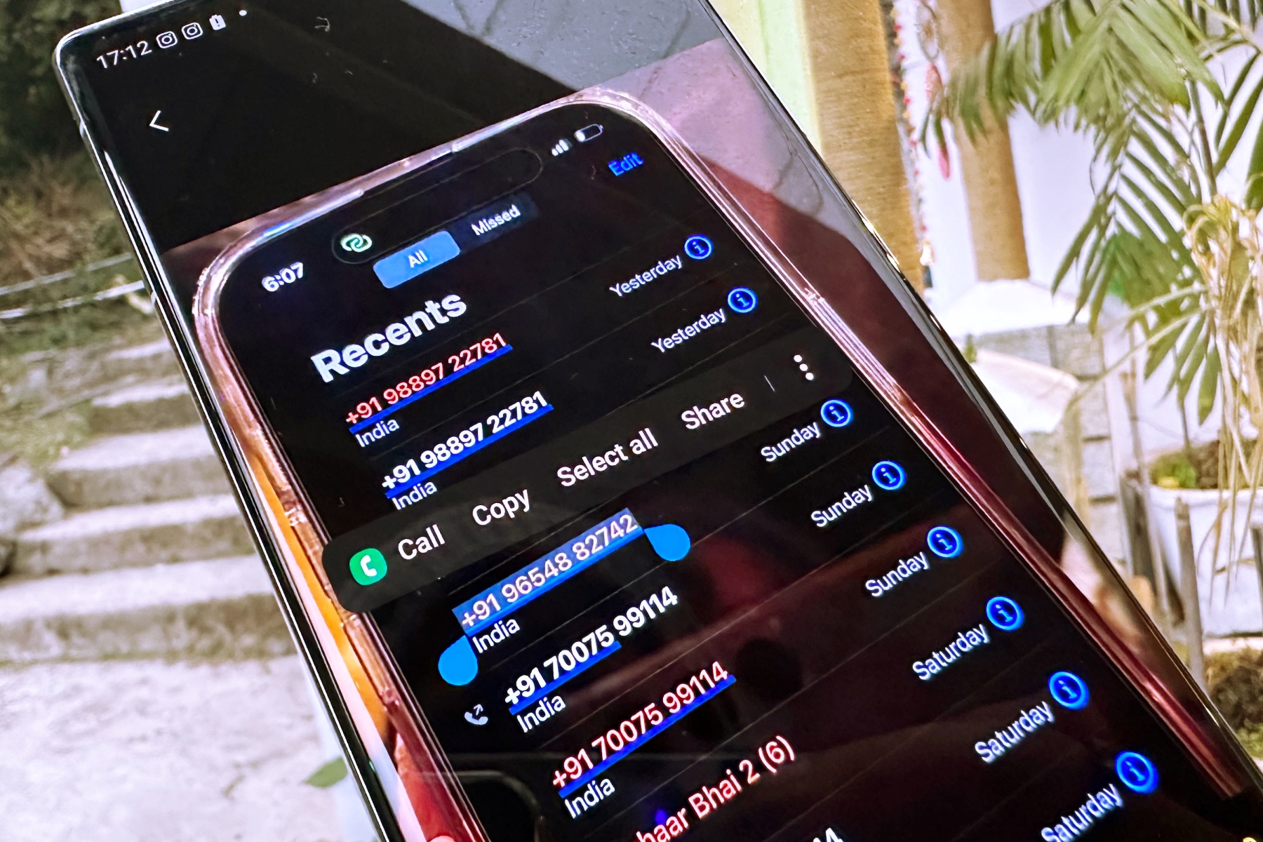
Fortunately, Samsung’s implementation is quite polished, and it even identifies text in images captured using the zoom camera. All you need to do is long press in the text area of an image, and the Optical Character Recognition (OCR) system automatically jumps into action.
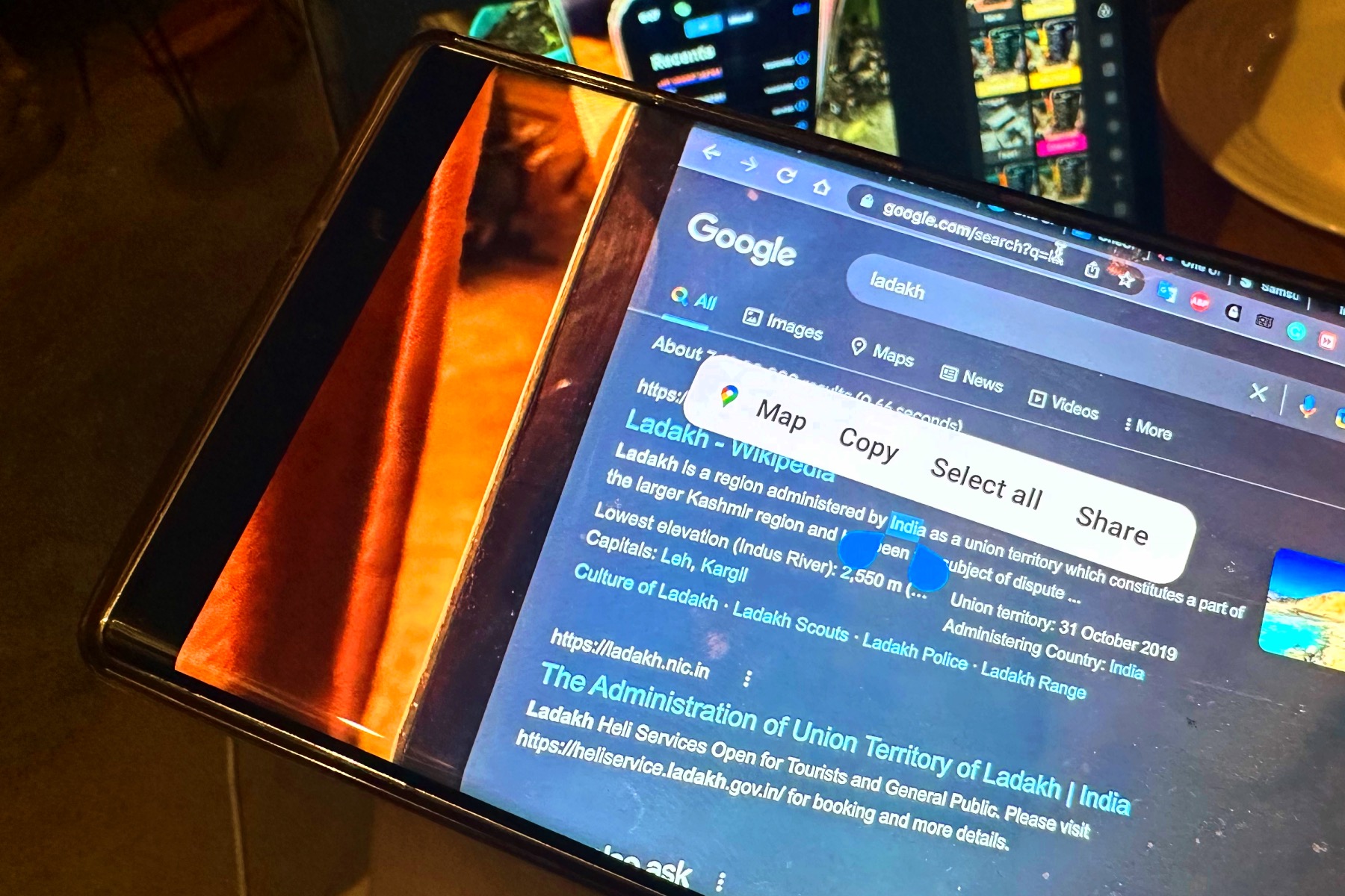
Once a section of the text is selected, you just have to move the grab handles to select the portion you need. You will then see options for selecting the entire text portion, copying the selected portion to the clipboard, or pulling up the share sheet window.
The feature also has a contextual side to it. For example, if an image has a phone number in it, the contextual menu that pops up upon selecting the phone number shows the option for making a voice call or sending a text message. If the selected text happens to be the name of a place, One UI 5 shows you a Map option in the context menu that directly opens a navigation overview of that place.
Apple’s implementation is still more versatile, as it lets you directly add a number to contacts, search the selected word on the internet, and even translate it. Samsung will likely flesh out its version down the road, but for now, the OCR system that arrived with One UI 5 has high accuracy.
Widget stacking with an AI boost

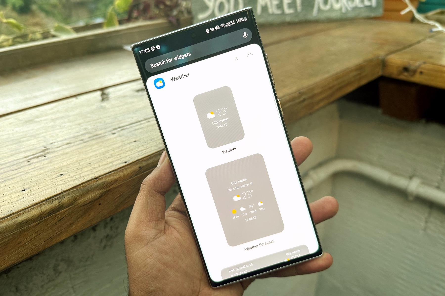
Next in line is the ability to stack widgets, which is again something that iOS has had for a while. However, Samsung’s implementation offers a higher degree of freedom regarding the size adjustment of each widget and its positioning on the screen.
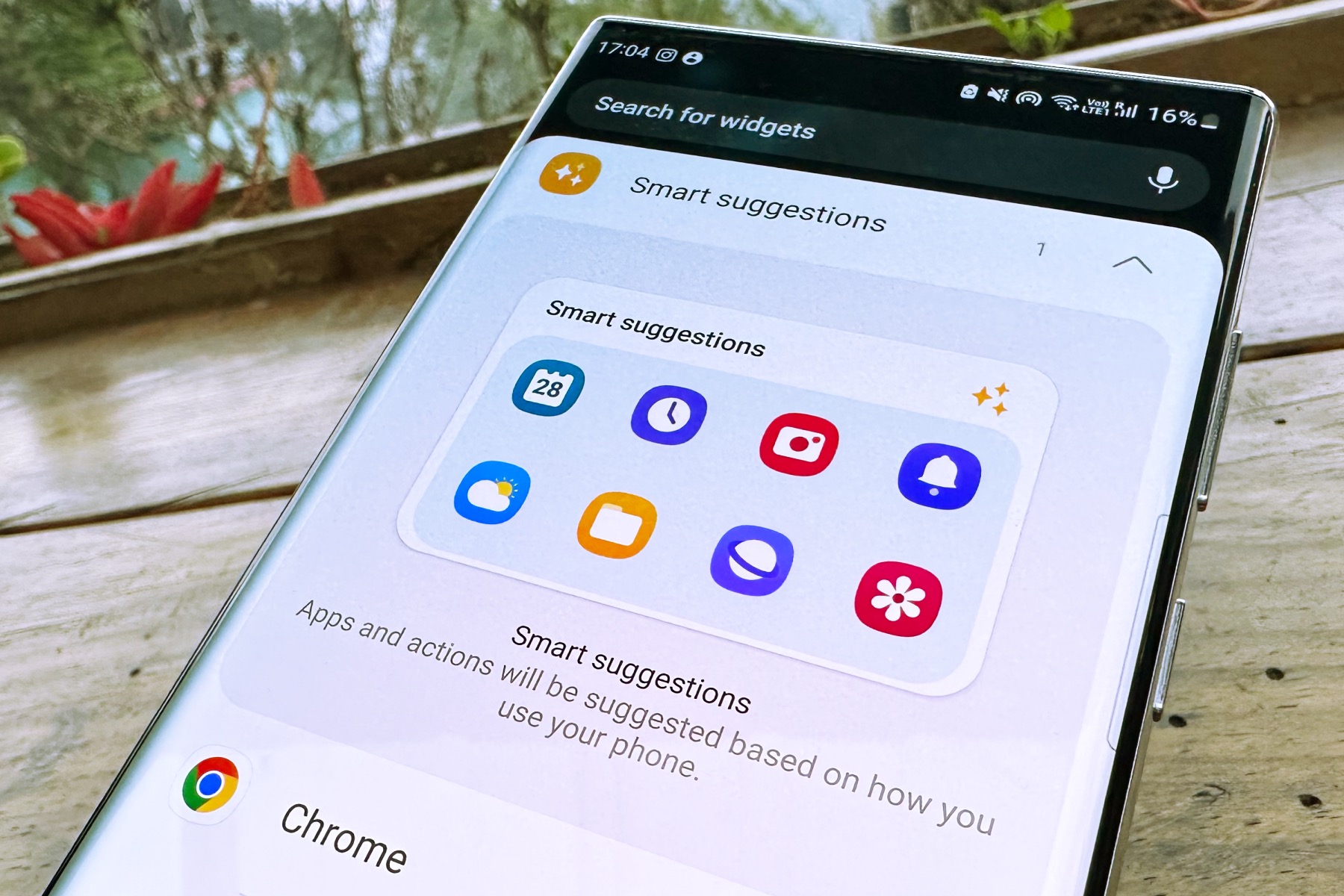
Another notable advantage over iOS 16 is the new Smart Suggestions widget that arrived with the One UI 5 update. To put it simply, it’s a 4×2 grid of apps curated by an AI engine that studies your usage pattern and suggests a list of apps that you are most likely to use at any given time of the day.
It’s a neat addition, especially if you are chasing that minimalist look for the Home Screen, but don’t want to clutter things up by putting a ton of apps and shortcuts on the same page. In using the feature for a week, I found that the list of apps populated in the Smart Suggestions widget was almost always on point.
Every time I unlock my phone, the Smart Suggestions widget saved me the hassle of pulling up the app drawer to find an app or doing a text-based search. It might not look like a huge achievement from a technical standpoint, but it’s just one of those quality-of-life upgrades that make a pleasant difference as you get used to the convenience.
Coupled with the sidebar that is always a swipe away from the left or right edge of the screen, giving you quick access to core tools, One UI 5 has really elevated my experience — especially while working on the Galaxy Tab S8.
The most granular notification controls

“Notifications are the bane of my tech life.” I often repeat this line every time I unlock my phone, only to be greeted by an endless barrage of distracting notifications that occasionally gets too overwhelming. Thankfully, One UI 5 introduces a bunch of new notification controls that can reduce the notification clutter and make them less frustrating to interact with.
Starting with the notification appearance, you can specify if an app alert appears on the lock screen, whether it can show a badge for the number of alerts, and if it should open a pop-up view if you tap or long press on it. As a measure of privacy, you can prevent the notification content from being visible on the lock screen.
It’s just a great system for filtering unnecessary chatter that only alerts you when something important has happened.
For apps where it is relevant — for example, Amazon Music — you even have controls like only showing the notification alert, blocking the music playback bar, hiding the download status bar, and blocking only the podcast playback bar while the music playback widget remains active.
The sheer range of controls is even wider for social media apps. Take, for example, the popular meme-sharing app 9Gag. You can customize its notification behavior to show only alerts for upvotes, post comments, show a post being promoted by the algorithm, and a lot more.

The expansive list of control toggles is a bit overwhelming, but it’s a one-time effort. Once you’ve tailored the notification behavior to your liking, the effort will prove to be worth it. It’s just a great system for filtering unnecessary chatter that only alerts you when something important has happened.
I use Discord for work communication, but have also joined an unhealthy number of channels discussing game fan fiction and mechanical keyboards. So far, I’ve kept my
Another neat addition is the ability to directly control the notification behavior from within an app. When you long press on an app’s notification and tap on the Settings button that appears below it, you will head straight to the app’s settings section, where you have access to granular controls.
Don’t see the option you’re looking for? At the bottom of the page, you have an option that says In-app notification settings, which will redirect you to the settings page inside that particular app. Again, it’s a minor addition, but it saves you the hassle of juggling between two apps when you’re trying to streamline the notification behavior to your liking.

One UI 5 also lets you set exceptions when you want to see urgent alerts from a few critical apps but have enabled the Do Not Disturb mode. Another underrated – but equally important upgrade – is seeking permission. When you open an app for the first time, you will see a dialogue box explicitly asking for your permission to send notifications.
If it’s an app that isn’t important, you can block it from sending unnecessary notifications right away. One final change people will appreciate from a privacy perspective is the ability to hide notifications when connected to a TV. If your phone is linked to a TV using the Smart View feature, you can block the phone notifications so that everyone in the room staring at the TV doesn’t see those alerts.
Sticker-making is seriously easy, and fun

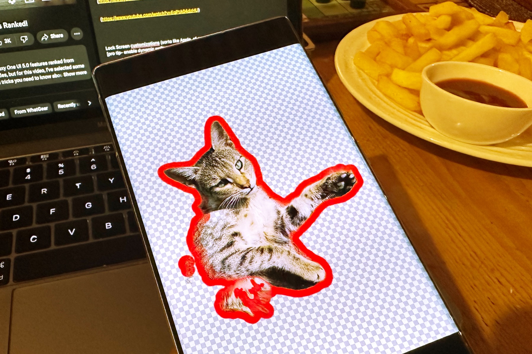
Last but not least, this is a fun one. You no longer have to rely on advanced image-editing tools and get frustrated with the hit-or-miss experience of making stickers in another app. With One UI 5, Samsung has added an advanced sticker-creation tool right in the gallery app that turns silly selfies and cute pet photos into stickers. And the whole process takes less than 30 seconds.

All you need to do is to open an image in the Gallery app, tap on the pencil-shaped markup icon, select the smiley face option at the bottom, and then tap on the option that says Stickers. Now, you will see a flower-shaped icon at the bottom that lets you add a picture from the gallery.
Once there, you can choose between different selection and snapping options. If you’ve got artistic hands, you can select manually and extract only the part that you want to turn into a sticker. Sound confusing? Watch this short video where I transform a selfie into a weird sticker in 30 seconds.
https://twitter.com/nsnadeemsarwar/status/1593167480020938753
The stickers you create in Samsung’s Gallery are saved to the keyboard’s sticker section, and you can slap them atop any image you want to jazz up.
A certain colleague of mine has haunted me with myriad stickers. I guess it’s payback time, and I have a few dozen stickers ready to become the DM tormentor myself.
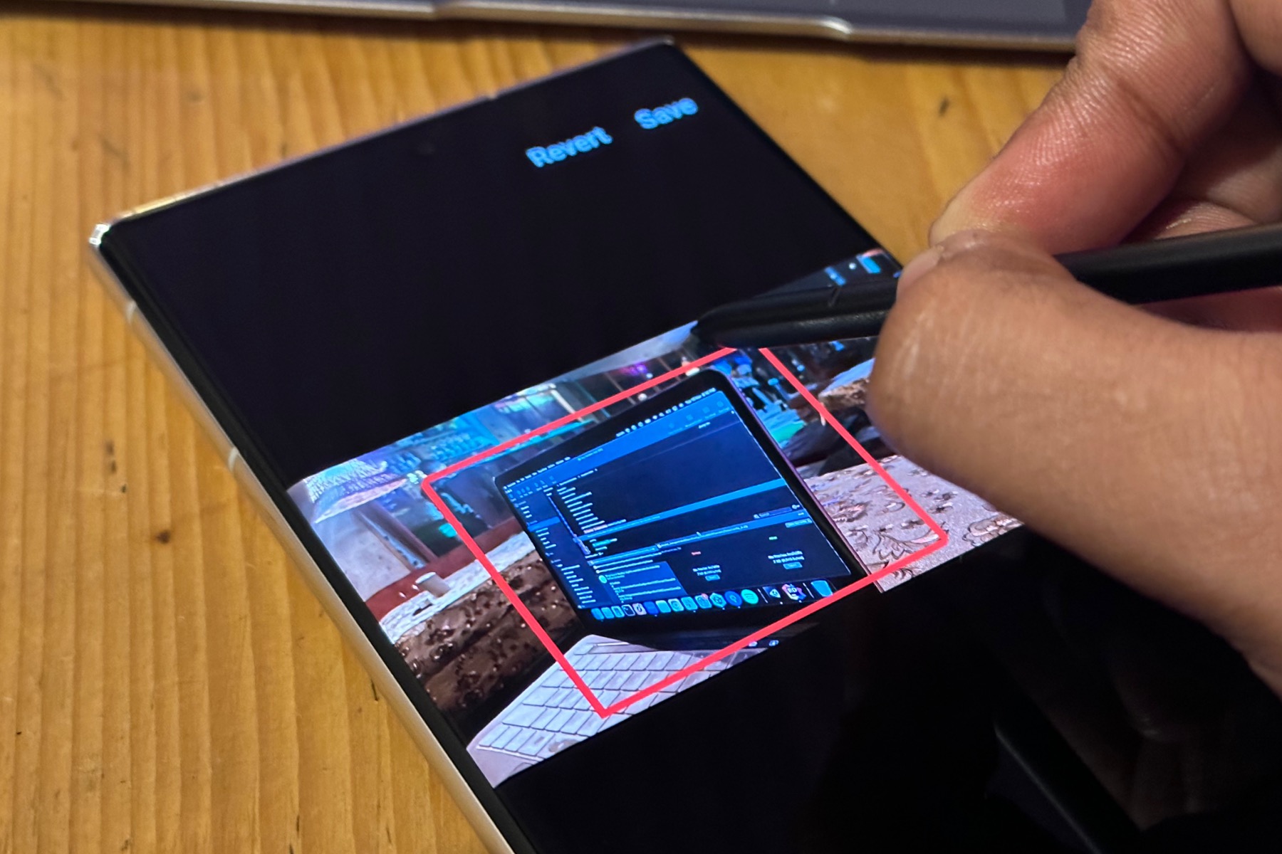
Another cool and meaningful addition is the automatic shape correction. When you draw a shape in an image — say, for highlighting a certain object by drawing around it — and hold on to the outline, it will automatically turn into a regular shape. I’ve tried my fair share of gibberish rectangles and wavy circles, but the markup system corrects them really well and makes the highlights look a lot less messy.
Those aren’t all of the features you’ll find in Samsung’s Android 13/One UI 5 update, but they’re certainly among the best.
