The Nothing Phone 2 is here. It’s the second Android phone from Nothing, the company’s first one to fully launch in the U.S., and one of the most important smartphones of the year.
There’s plenty to say about the Nothing Phone 2. I could talk about the importance of a new
But I don’t want to say any of that. Instead, I want to talk about the Nothing Phone 2 in a much simpler manner. This is a $599 Android phone that I’ve been using for over two weeks. It’s not perfect, but it’s shockingly great in so many ways I wasn’t expecting.
If you’re ready for a new
This design really is something

I adore the design of the Nothing Phone 2 — for a few different reasons.
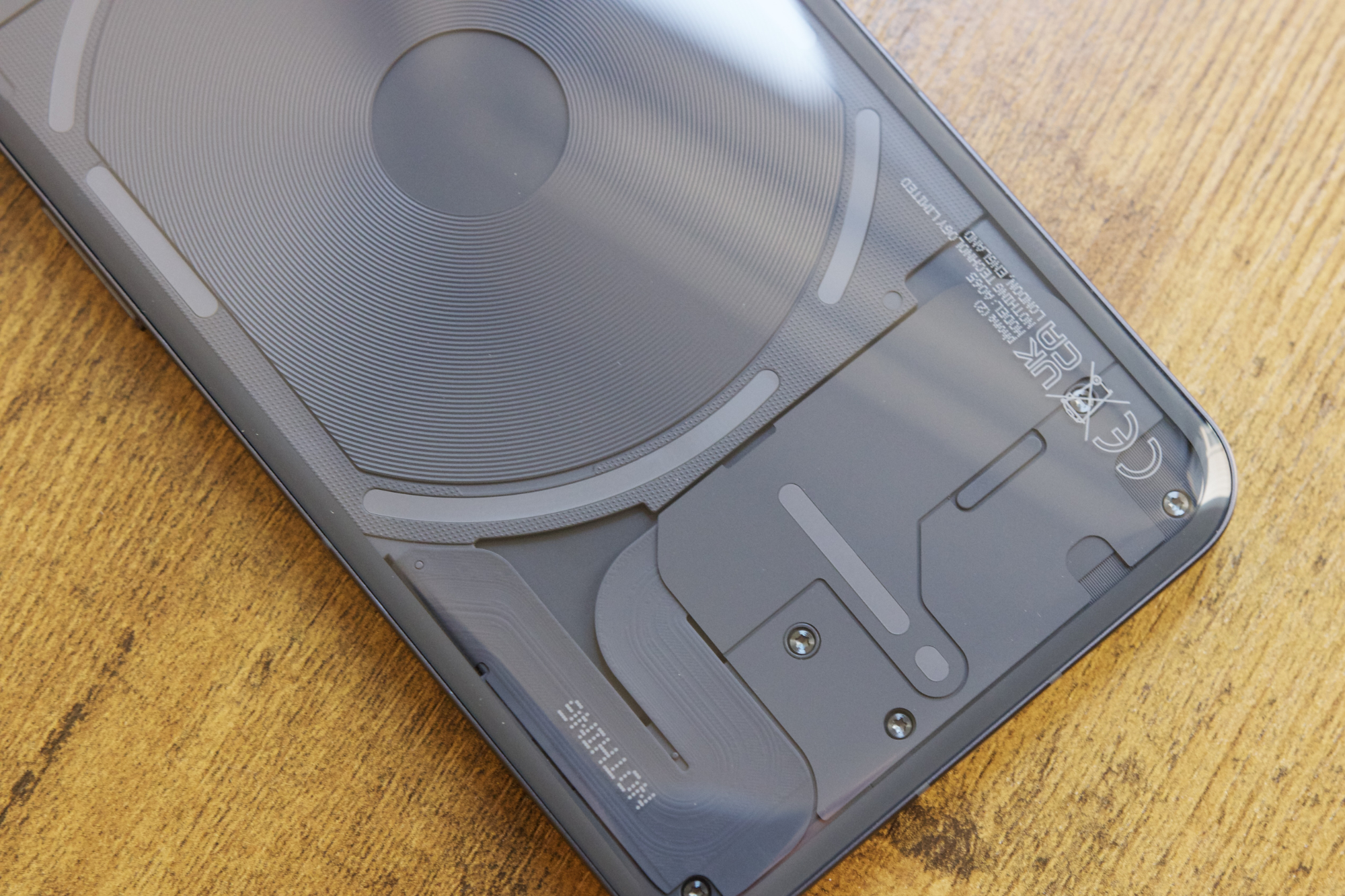
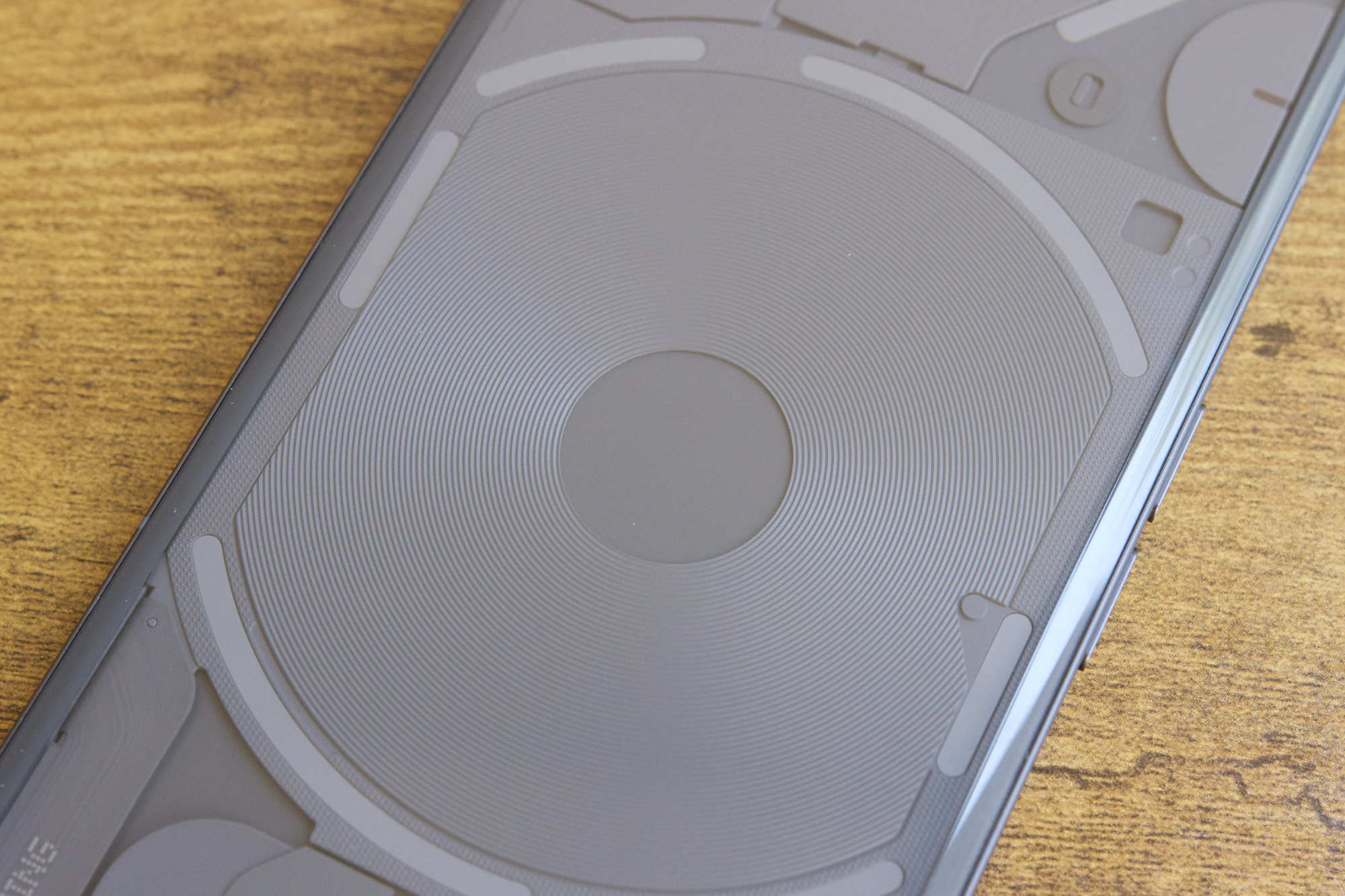
Of course, we have to talk about the transparent backside with the Glyph lights. The lights are more functional than they were on the Nothing Phone 1, — you can use them for visual timers, to see your current volume level, and even keep an eye on how close your Uber is.
These are all neat additions to the Nothing Phone 2, but my favorite part about the Glyph lights has nothing to do with their new feature set. I simply treasure how they make the Nothing Phone 2 look.
Take a look around at some of the biggest smartphones available today — be it the Samsung Galaxy S23 Ultra, the iPhone 14 Pro, or anything else. Most smartphones look boring. Other than differently shaped camera housings or new colors, there’s not much design flair happening in the
This is one of the few phones I cherish looking at. The transparent glass on the back shows all of the neatly packed components that make the Nothing Phone 2 tick. The wireless charging coil is front and center. There are countless lines and textures everywhere you look. The layout of the Glyph lights adds real visual interest, even when they aren’t doing anything. I typically don’t care that much about how my phone looks, but the Nothing Phone 2 has given me a renewed appreciation for legitimately good design — and it’s a phone I’ve been proud to carry with me everywhere I go.
Beyond its excellent aesthetics, I’ve also been impressed with the fit and finish of the Nothing Phone 2’s hardware. Nothing didn’t just make a good-looking phone; it also made a really well-built phone.
The subtle curves around the back glass allow the Nothing Phone 2 to comfortably nestle into your hand. Where the Nothing Phone 1 had sharp edges that could get quite uncomfortable at times, the Nothing Phone 2 feels like it was meant to be held. Similarly, despite being just 2mm shorter than the iPhone 14 Pro Max, the Nothing Phone 2 is over 40 grams lighter. It’s a big phone, but it’s one that I actually enjoy holding for long stretches at a time — something I can’t say about Apple’s flagship phone.
Nothing didn’t just make a good-looking phone; it also made a really well-built phone.
When you combine all of that with a good vibration motor, excellent buttons, and a reliable in-screen fingerprint sensor, you start to realize that the Nothing Phone 2’s design is close to perfect. And that’s because it is.
All of the specs are fantastic

A gadget like the Nothing Phone 2 is a tricky one to pull off. Nothing could have stopped with the flashy design and called it a day, opting for mediocre specs that are OK but nothing special — sort of like it did for the Nothing Phone 1. But the company made some really meaningful spec upgrades for the Nothing Phone 2, and it shows.
A big highlight is the Snapdragon 8+ Gen 1 chipset that powers the phone. Although it’s not the newest mobile chip in Qualcomm’s portfolio, it remains one of the best. Performance on the Nothing Phone 2 is, in a word, excellent. No matter what apps or games you throw the phone’s way — even back-to-back matches of Call of Duty: Mobile — it holds up like a champ. It runs smoothly, confidently, and without getting too hot under pressure.

Similarly, battery life has been a complete nonissue during my entire time with the Nothing Phone 2. If I’m doing a lot of gaming, constantly listening to podcasts throughout the day, and watching more
And when it does come time to refuel, I’ve been quite pleased with the options at my disposal. When I use my trusty Anker charger, the 45-watt max charging of the Nothing Phone 2 gets me a full battery in just under an hour. And if I’m not in as much of a hurry, I love having the option to throw it on a wireless charging pad, too.
Nothing had so many chances to cut little corners — be it with a less capable chipset, a smaller battery, or less robust charging options. But it didn’t, and that really shows in day-to-day use with the
The camera is shockingly good

I went into the Nothing Phone 2 not knowing what to expect from its camera system. It’s a $599
Apparently not!
To be clear, the Nothing Phone 2 doesn’t have the very best camera system you can get on a
I think what’s impressed me the most with the Nothing Phone 2 is just how reliable it is. I can take the phone out of my pocket, open the camera app, snap a quick photo, and feel quite confident that I’ll be happy with what it looks like. Whether I’m taking a picture of my dog while out on a walk, a yummy dessert during a local ice cream social, or a nice IPA in a beer garden to wind down a relaxing Saturday, the Nothing Phone 2 continues to produce photos that I’m consistently happy with.
I haven’t pixel-peeped or deeply analyzed any of the pictures I’ve taken with the Nothing Phone 2, but when I look back through my gallery of all the photos I’ve snapped, I’m finding very little to complain about. Do I wish there was a telephoto camera to offer more than 2x zoom? Yes. Do I wish I could take better nighttime photos? Sure. But for a phone of this caliber, where great camera quality isn’t necessarily a given, the Nothing Phone 2 punches way above its class.
Nothing OS 2.0 is a joy to use

The Nothing Phone 2 ships with Nothing’s custom fork of

You can use Nothing OS with traditional app icons, but there’s also a monochrome option that paints all of your app icons in a subdued black-and-white color scheme. I’m still not 100% sure how I feel about it, especially because it makes some apps more difficult to identify from your home screen or app drawer. But it also looks clean, stylish, and unlike any other
The best part? Nothing offers all of this while keeping Nothing OS 2.0 blistering fast. The software is smooth, easy to navigate, and never feels weighed down or too heavy. It’s a perfect mix of everything, and it’s made Nothing OS 2.0 a contender for one of my favorite
You should absolutely buy the Nothing Phone 2

What does all of this mean for you? It’s like the subhead above suggests — you should buy the Nothing Phone 2.
There are so many good phones to choose from right now. No matter your budget or what features you’re looking for, it’s more difficult than ever to buy a truly terrible
How does it do that? For all of the reasons mentioned above. Here’s a phone with a killer design that looks and feels outstanding. It has a fantastic processor that delivers great performance and reliable battery life. You’re getting a camera system that’s a lot of fun to shoot with. And if you’re an aficionado of good software, Nothing OS 2.0 impresses. Those are all qualities I’d be thrilled to have on a $1,000 flagship, so the fact that you’re getting these things on a phone that costs $599 is all the more impressive.
The Nothing Phone 2 should be your next
There are serious questions about the Nothing Phone 2 that still need to be answered. How quickly will Nothing deliver software updates? How will the company’s customer support team perform when you need after-sale support? Will warranty claims be easy to process? There’s uncertainty that comes with any new company, especially one in the tech space like Nothing. But my two weeks with the Nothing Phone 2 have been bliss, and if you have $599 and are in the market for a new phone, I can’t recommend it enough. The Nothing Phone 2 should be your next


