Let’s face it, spreadsheets are not appealing. It gives you what you need within a designated square, but it isn’t going to catch your eye, hold your attention, or provide any sort of visual stimulus. You need to spice up that data; give it a look that’ll make you pay extra attention. Mem:o for iPad can provide the flair your functional data needs.

Setting your unit type is part of creating a new board in Mem:o. Your board is the visualization of a certain set of data. Along with a unit type, you add the colors you’d like to see and the values needed. From there, you can enter different points of data that correlate to days and times. The editor is a simple input of numbers and selecting a time on a calendar, but you can also attach a note to a mem:o or tag it for extra organization.
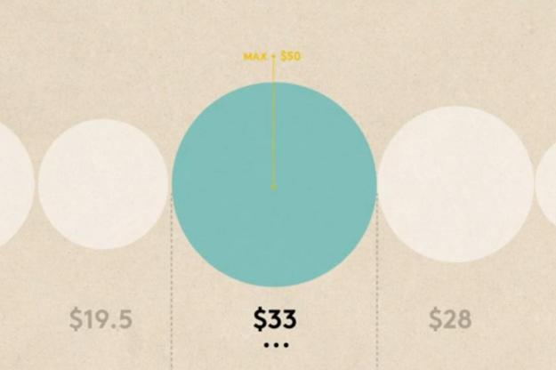
After creating a mem:o, it posts to the specific board that you placed it on. Boards can be viewed individually or all as one, which gives you a beautifully designed layout through which to view all your data. Spread across the screen in vibrant, circular shapes, you can simply tap a circle to zoom in on that point of data and see the details attached to it or just marvel at the simplistic beauty of all the information you’ve stored. You can even change over to a calendar view that will place all of your info across the familiar grid style layout, but done with your data pinned to it in an easy to access way. Any day with a Mem:o attached to it can be tapped to reveal more about the number housed there.

The app’s navigation is plain and unobtrusive. In the corners of your screen at any given time are black dots, with the exception of the lower right which holds a “home” symbol. These dots will help you move around within the app. Tapping any of the dots will switch over to the navigation view, as the upper left reveals the option to switch from Board and Calendar view styles. The Lower left is an information tab that walks you through how to use Mem:o, and the upper right is a button to quickly add a new data point to the board of your choosing. All of these options are always available but never made glaringly obvious or distracting. It’s really a wonderful way to have users maneuver in app.
If you’re not one that is easily impressed by slick animations, eye-catching colors, or sharp typography and you want to get to the nitty gritty of your numbers, you don’t have to rule out Mem:o. It’s equipped to perform calculations, handling total and maximum sums or deal with negative numbers. It’s not a fully equipped as an Excel style program, but it’s more than enough to keep track of any kind of daily activity.
Information and data serves a valuable purpose in our world, but it doesn’t make spreadsheets and plain old charts and graphs any more interesting. Mem:o is the perfect bridge between functionality and visual charm. It’s more than able be used for any of your basic statistical needs and has that extra layer of engagingness that isn’t present in other options. If you’re not a numbers person, it’s probably difficult to imagine tracking data to ever be fun, but Mem:o might be enough to change your mind.
Mem:o is available for $2 for the iPad from the iTunes App Store.


