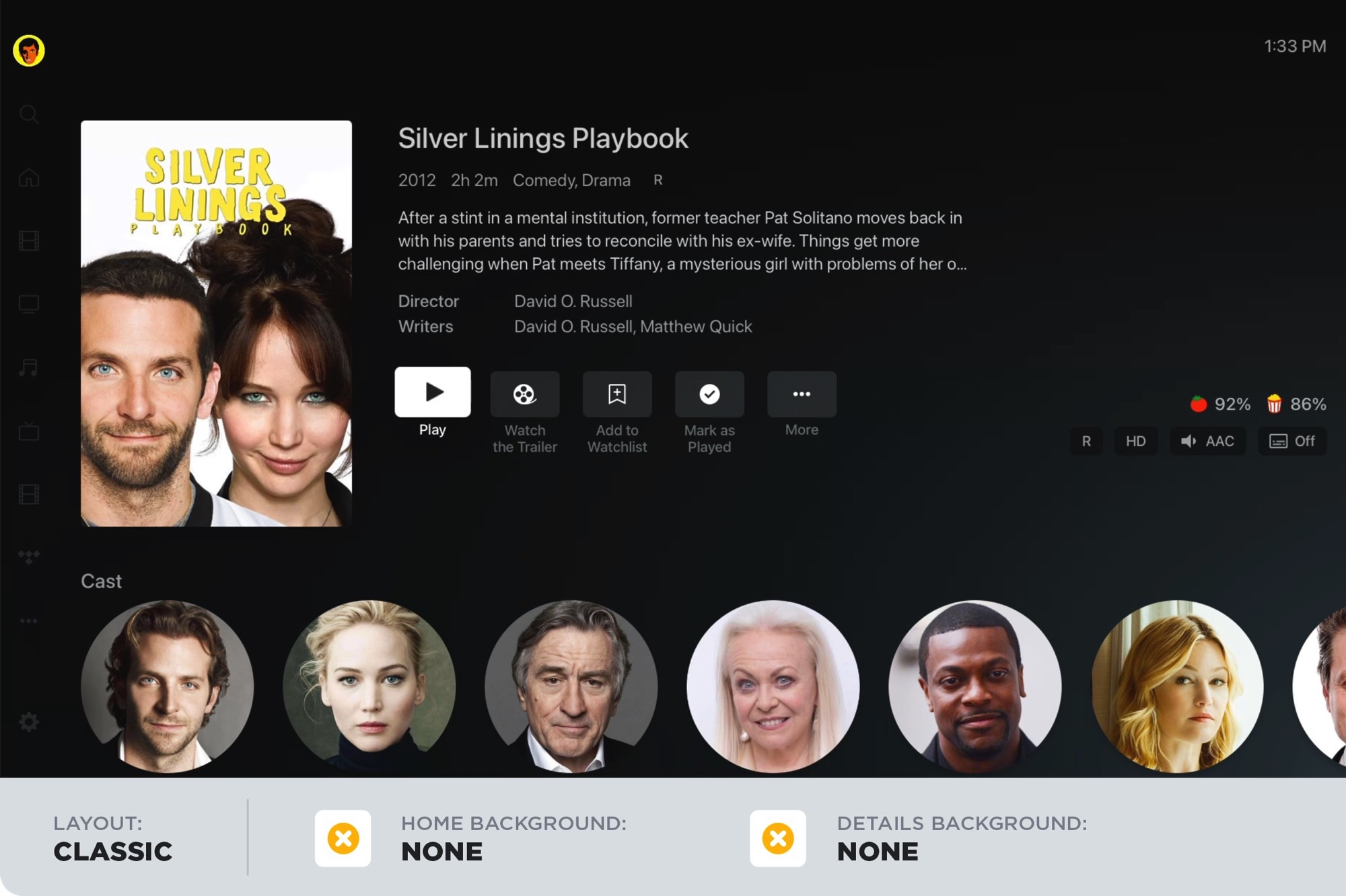
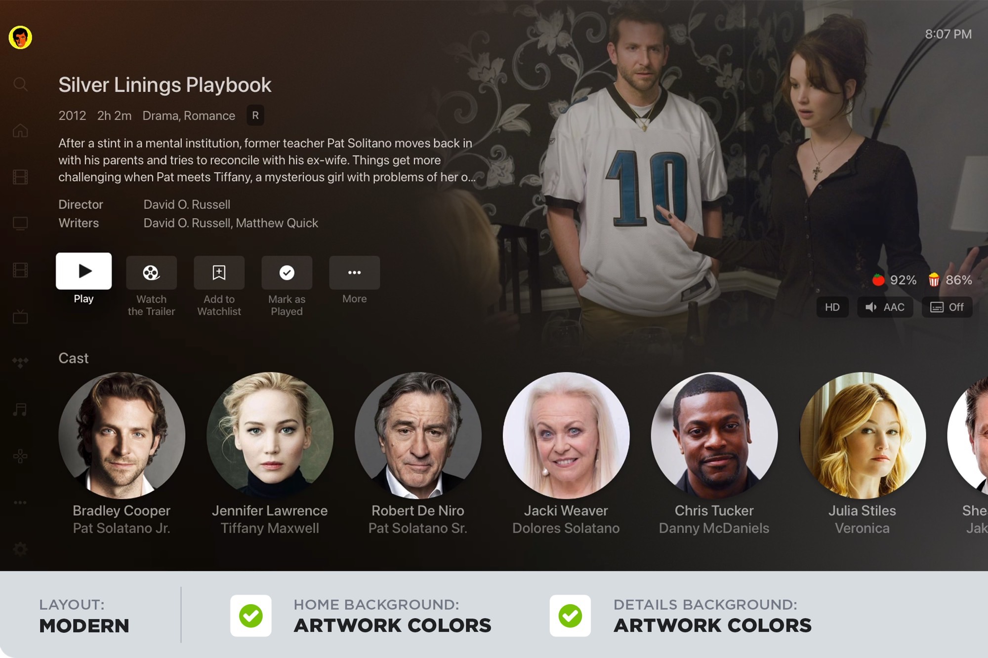
Plex, the company that gives folks a way to easily manage and access their personal library of movies, TV shows, music, and photos, is rolling out a new look for its on-screen interface. Dubbed “Modern,” it leverages the artwork for a selected movie or TV show to create a more immersive look, instead of the typical poster-on-a-black-background design that has defined the Plex experience for years. The new design will appear today on Apple TV and Roku clients, with Android TV coming shortly. Eventually, Plex’s other clients will be included too.
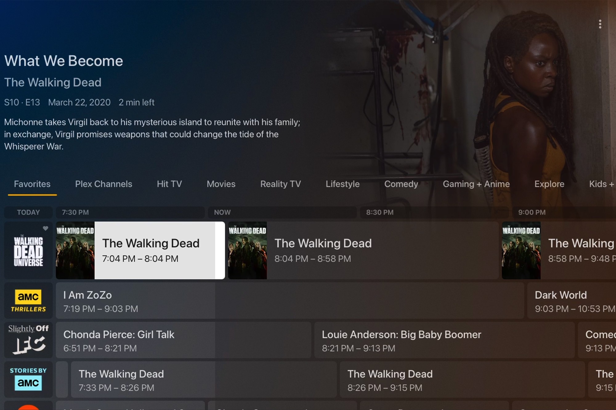
The new look can be seen on the Plex home page as well as the TV Guide and details pages that appear when you select a title from your library. Thankfully, if you’re not a fan of the Modern look, you can choose to stick with what Plex now refers to as its Classic interface. If you opt for the Modern design, Plex gives you control over how the artwork and the background colors mesh together. You can decide if you want Plex to automatically grab background colors from the title’s artwork, or stick with the default black gradient.

According to the Plex blog, the goal was to “place the movie artwork front and center and have the UI enhance — rather than compete with — the poster art.” This approach is most obvious on the Plex home screen. Before, movie and show posters were presented as a grid, with titles appearing directly below the posters. Because this didn’t leave much room for text, longer titles became truncated and you could only see them as scrolling text when you moved the active selection over the movie you were interested in. With the new interface, the movie or show posters act as their own titles — the theory being that most posters do a pretty good job communicating their titles. Moving the selection to a specific title brings up the full show-specific info (title, description, year, runtime, etc.) at the top of the home page, along with an artwork-inspired background.
Plex claims that the Modern interface was the result of considerable user consultation:
“We invited our test users to try out the new UI available in several of our big-screen apps. As the experiment ran over several weeks, we closely followed the feedback that was provided by the users as they posted in our forums. Well over 350 (and counting!) comments were made on the experiment topic, providing a wealth of constructive feedback, ideas, and discussion.”
Those comments were then taken into consideration as the Plex design team worked out the final details.
In addition to letting you manage your media library more effectively, Plex has introduced several additional features over the last two years, including:
- A free, ad-supported movie and TV service.
- A subscription gaming service.
- A new way to do music discovery within your personal music library.


