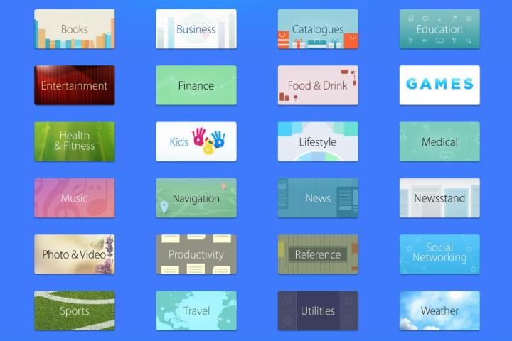
In an effort to improve app discovery within both the iOS and desktop versions of its app store, Apple on Thursday rolled out an easy-on-the-eyes ‘browse by category’ section.
While before users could only click on the ‘categories’ tab in the top left of the display to bring up a drop-down list, there’s now the added option of tapping a ‘categories’ link at the top of the screen to bring up a more visually attractive display showing off a wide variety of curated app collections.
Other improvements to discovery were announced at Apple’s recent WWDC event, and will roll out with the launch of iOS 8 later this year. These include trending searches to highlight what’s popular at any given time, related searches offering additional suggestions, and a new Explore tab that further enhances the way apps are categorized. Other incoming features designed to spruce up the iOS store include continuous scrolling within results, an Editors’ Choice tag for the best apps, and the inclusion of app demo videos.
The improvements are meant to please not only iDevice owners looking for great apps and fresh content, but also developers keen to make a success of their work. With more than a million apps in the iOS app store and new ones being added all the time, getting their software discovered is proving increasingly difficult for developers. The launch on Thursday of the new ‘browse by category’ section, together with the changes coming to iOS 8, should go some way to remedying the situation.

