“The fashionable Garmin Vivomove may have a hidden screen, but once you put it on, the watch's extensive technology and health tracking talents are obvious.”
- Looks like a fashion watch
- Screen entirely hidden when not in use
- Gesture controls are reliable
- Comprehensive health and activity tracking
- OLED screen is low resolution
- Battery life is only average
Garmin’s new-for-2022 Vivomove Sport is a hybrid smartwatch in the truest sense, as it has physical hands that move around the dial, and a screen that stays totally hidden until it’s needed. It’s the antithesis of the Fitbit Versa 3, which is its biggest rival and will appeal to anyone who finds the Fitbit’s boring design off-putting. The good news is, the design isn’t the only thing to like about the Vivomove Sport, as I’ve found out.
Design
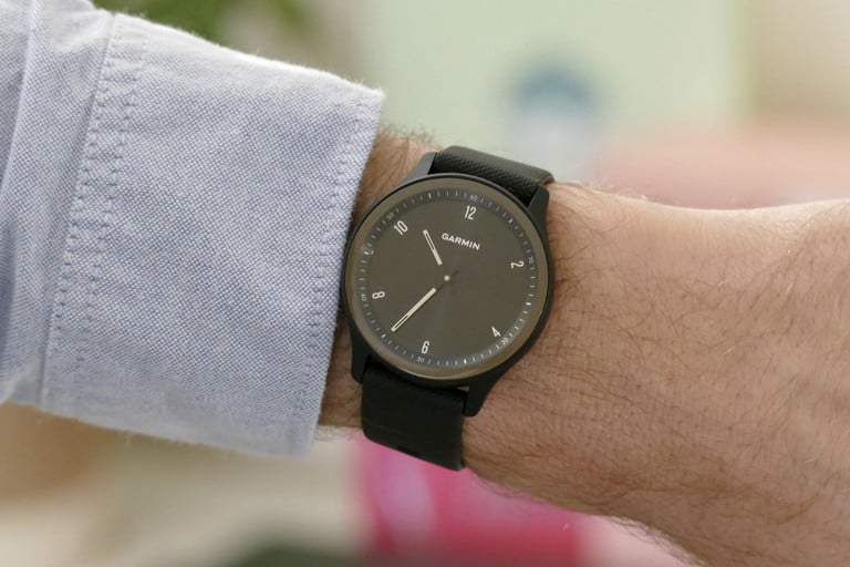
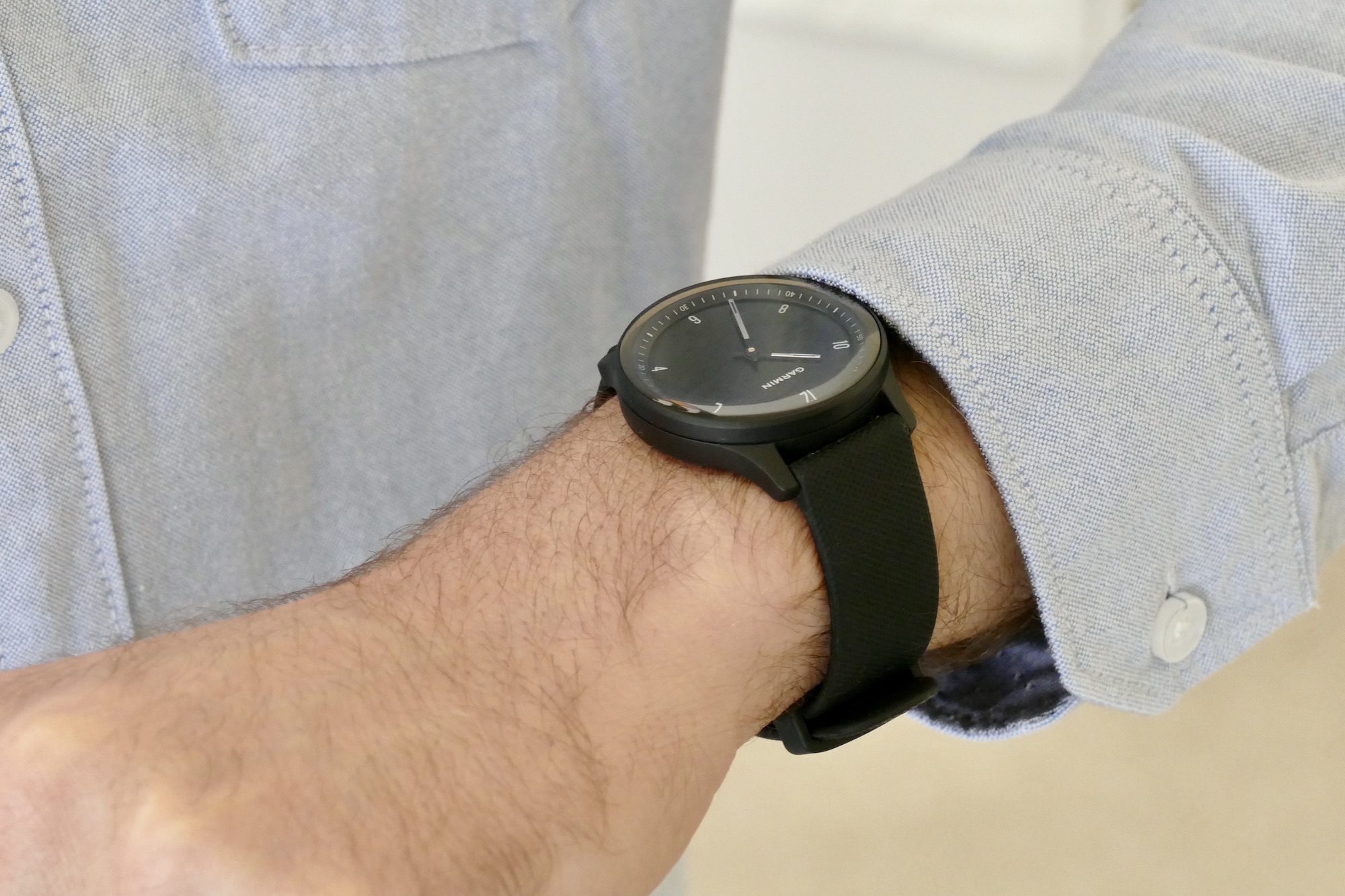
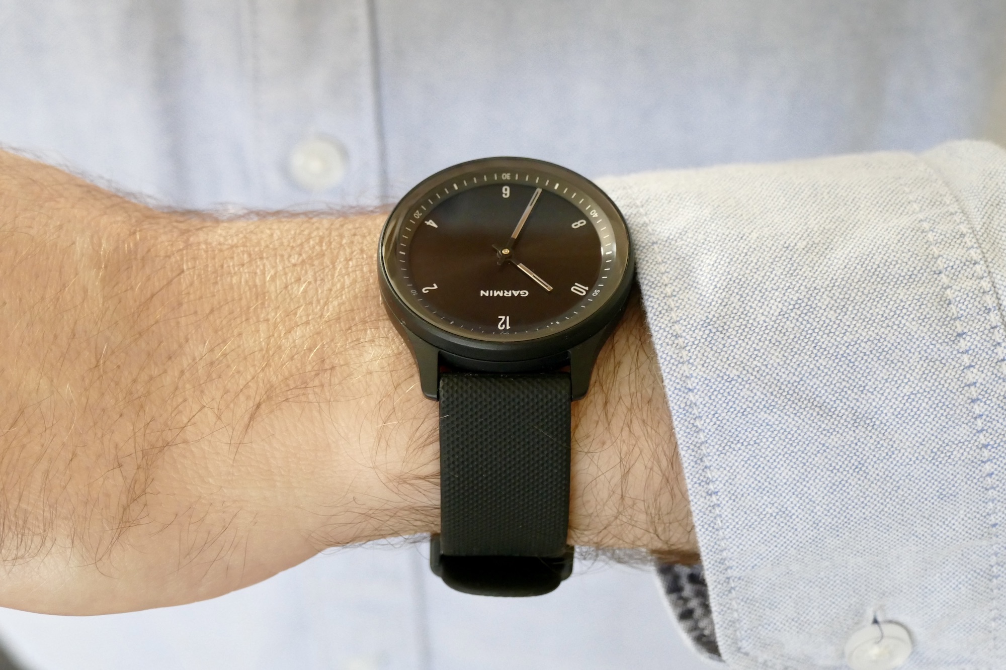
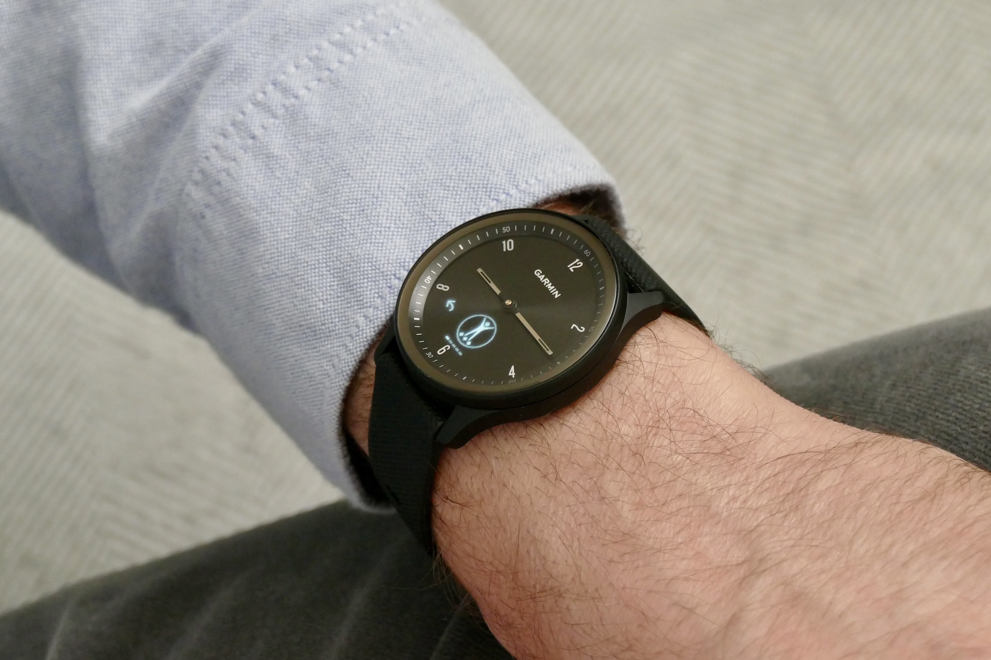
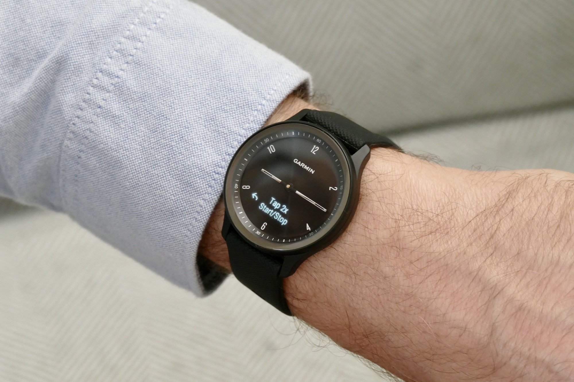
The Garmin Vivomove Sport is very good at disguising its hybrid smartwatch status, due to the small OLED screen being completely hidden until it’s needed. When I say completely, I mean it. I dare you to look a the photos with the screen off and tell me there’s one there at all. I really like this approach, especially as more hybrid smartwatches now integrate always-on E-Ink screens, where the design edges away from “watch” and far closer to “smartwatch.”

Not so here, and it looks great for it. The dial is simple, with Garmin’s branding stamped on it, six hour markers, and some superfluous chronograph-style markings on the bezel. The surface has a subtle vinyl record-style finish which is barely noticeable unless you look really closely, while the baton hands are silver. There’s no second hand, no buttons on the case, and no crown either.

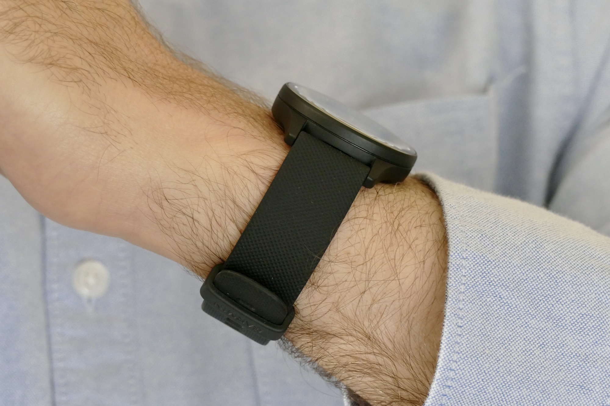
The case is made from fiber-reinforced polymer (which Garmin has used for other models, including the Fenix range) and it has glass over the dial with a very slight curve at the edges. It’s smooth and warm to the touch, but it can get greasy. It’s attached to a basic rubber strap that’s in black on my review sample, but you can get the Vivomove Sport in Ivory, Cocoa, or Cool Mint colors too. The Vivomove Sport is very light at only 34 grams and comfortable to wear. I’ve had it on for 24-hours a day for five days without irritation or problems overnight, or even the need to adjust the strap due to it getting too hot or sweaty.

I like the design. It’s very understated but the simplicity means it goes with anything, especially in black, and the 40mm case size is modest and suitable for most wrists. You won’t make a statement wearing the Vivomove Sport, but because of the hidden screen, you won’t advertise you’re wearing a smartwatch either. It just looks like a fairly ordinary fashion watch. It’s exactly what a good hybrid smartwatch should be, and ideal for anyone who dislikes the inherent sportiness of a fitness band or the geekiness of a full touchscreen, but who understands the need for a screen to increase usefulness but doesn’t want to see it all the time.
Screen and menu
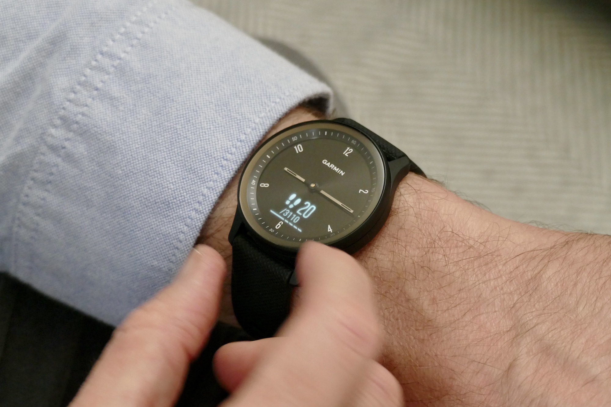
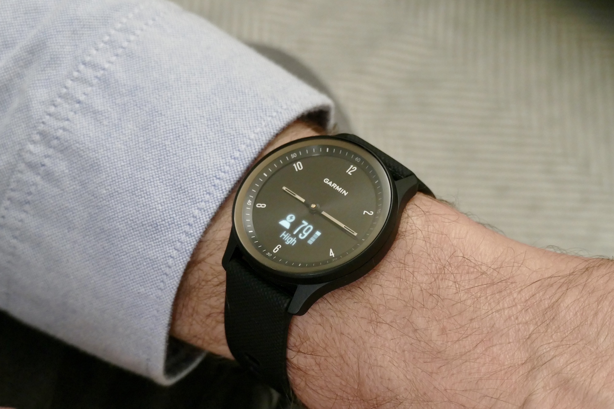
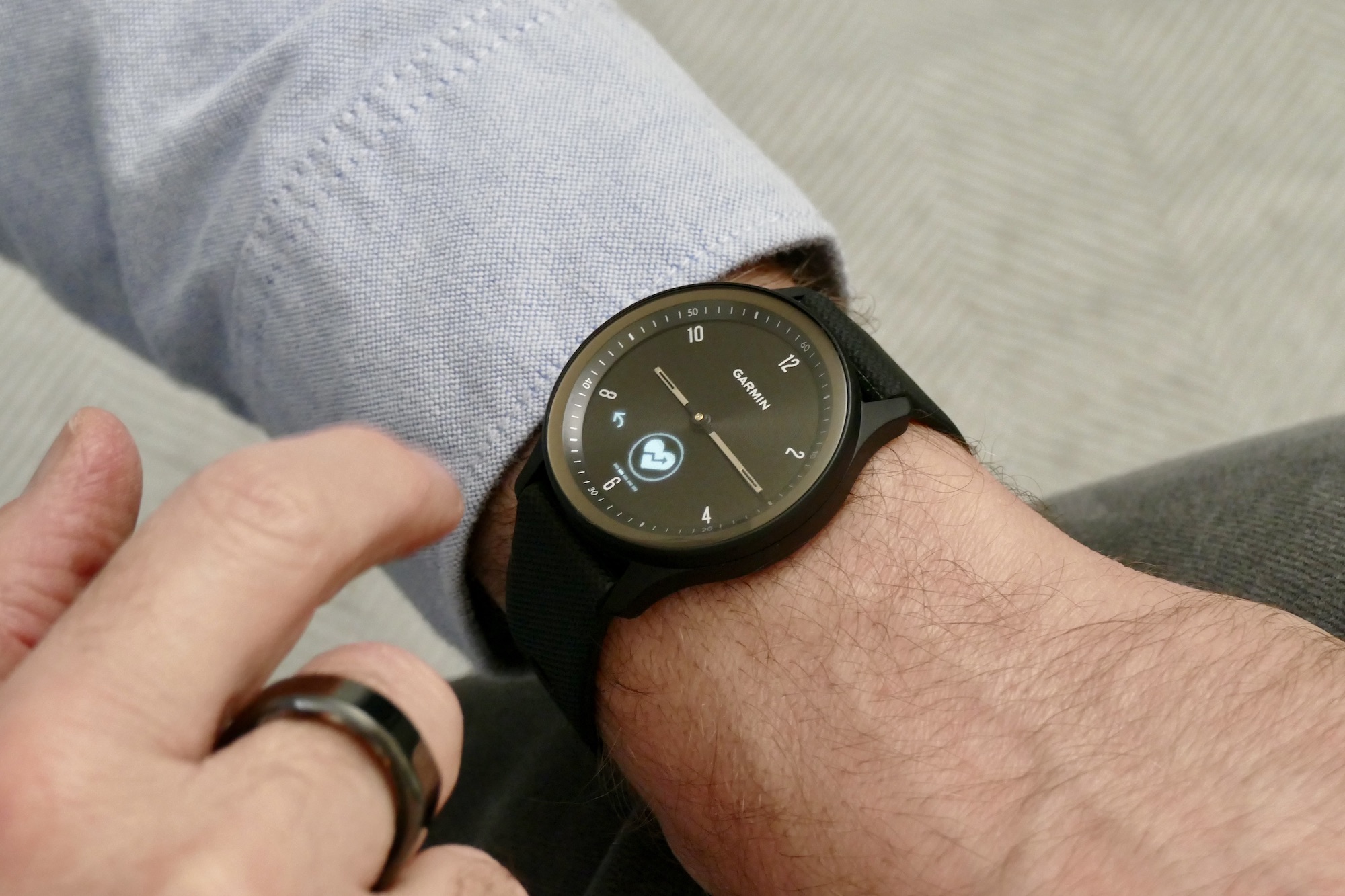
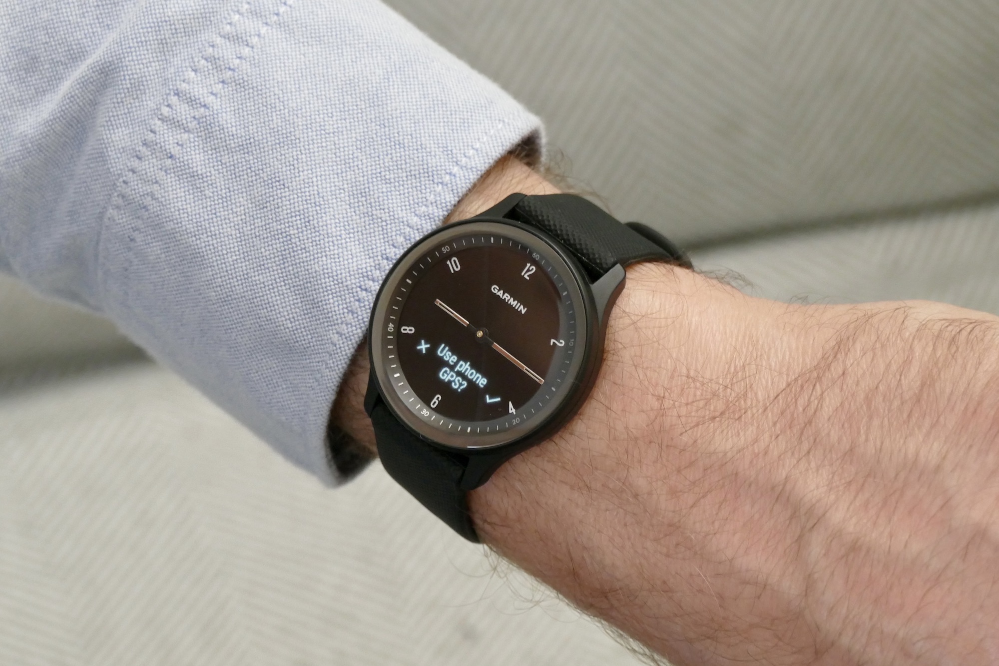
Garmin’s decision to hide the screen works from a design standpoint, but what about when it’s switched on? It activates when you raise your wrist or double tap on the glass, ready to show the time, battery status, and date information. Cleverly, you also tap the glass to operate the menu system, allowing Garmin to avoid buttons on the case, and it’s an accurate and reliable system. Swipe on the area with the screen to show steps, heart rate, health data, and more. The hands automatically rotate out of the way when you view these screens.
Long-press on the screen to open the workout menu where you can quickly activate a walk, run, cycle, weight training, yoga, meditation, or swimming session. Dig deeper and you will find more in-depth health features like VO2 Max, blood oxygen, and fitness age, plus some settings for the watch. On-screen options may look small, but they are actually easy to locate and press with your finger, due to the accuracy of the touch-sensitive glass on the watch.
Unfortunately, while the OLED screen is bright, it’s not very high resolution at just 72 x 154 pixels. There is a noticeable blur to the information presented, almost like it’s a little out of focus or the glass is smudged, and it looks out of place next to the physical hands and markings on the dial. It doesn’t affect functionality or legibility, but it’s distracting and cheap-looking.
Software and app
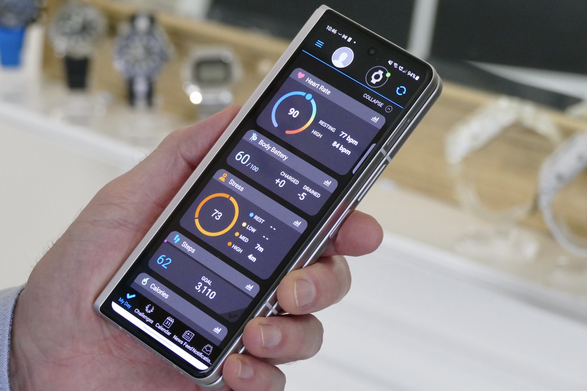
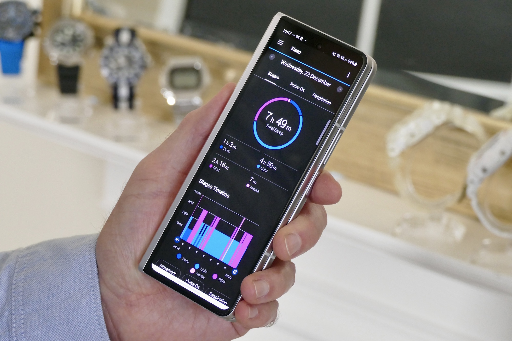
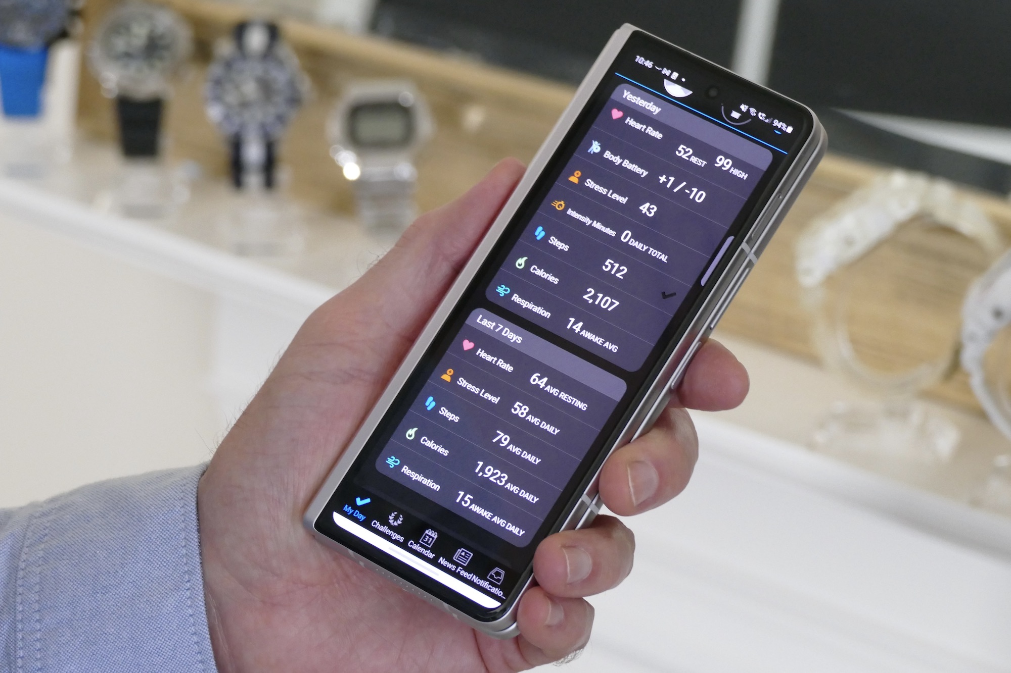
I have used the watch ahead of its release with the Garmin Connect app connected to a Samsung Galaxy Z Fold 3, and it’s also compatible with iOS. I have had no problems with the connection, and syncing has been faultless. It does miss out on a few features like Google Assistant or Siri integration, which you find on competing models like the Fitbit Versa 3.
Notifications are delivered reliably, but the screen is small so don’t expect anything other than basic glanceable information. Tap the incoming notification and you will get more details, but it’s of little benefit because one message spans multiple screens. The notifications work just as you want from a hybrid smartwatch: As a prompt to make a decision whether to reach for your phone or not.
By default, the vibration alert isn’t very strong, but if you explore the Settings menu, the length of time it buzzes can be increased although the battery life will suffer. It’s not the only customization option, as inside the app many aspects of the watch can be changed, from the watch face to the workout options shown, plus gesture control options to the alignment of the hands.
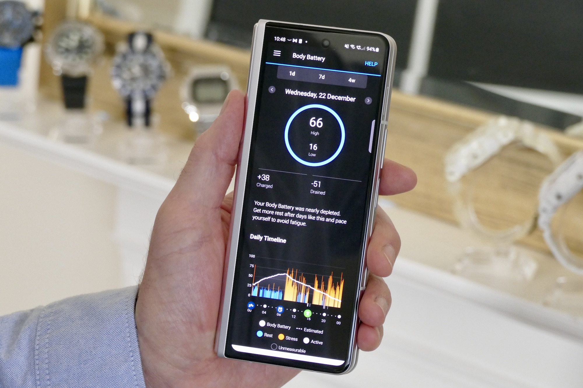
The Garmin Connect app is colorful to look at and fast to use. It is packed full of information and data, But I found it’s often densely presented and awkward to find. A slide-in menu gives even more options, and navigating around it all can be confusing and time-consuming. It’s definitely one for data junkies, and I rarely came across anything giving me advice on what to do with the data or how to make improvements. Instead, Garmin pushes you towards community challenges for motivation, either through pre-generated ones or ones you create yourself with friends.
The Vivomove Sport may not be an expensive Garmin sports smartwatch, but with Connect, it’s definitely still comprehensive enough for both casual exercisers and more serious sportspeople to use. There are features like adding details on your shoes and bike, saving courses you regularly run and then navigating them using Garmin’s PacePro pacing system, and the ability to create custom workouts for the watch to track. All your stats, from sleep to stress and heart rate, are viewable on individual screens with historical data for up to a year.
It’s as complex as you want it to be, and if you just want to track a workout or two each week, it’s just as willing to do that as it is anything more taxing.
Health tracking
I tracked workouts with the Vivomove Sport and the Apple Watch Series 7 together, and the Garmin returned figures notably higher than the Apple Watch. Average heart rate was around 10bpm higher from the Vivomove Sport, which likely impacted calorie burn which was usually 50 or 60 kcal higher too. Comparing the Garmin’s sleep tracking to the Oura Ring, neither agreed on sleep stage timing, but were almost identical for heart and respiratory rate.
None of these are medical devices, so results are always going to vary, but in my experience, the Apple Watch usually closely matches most other wearables when it comes to activity tracking and heart rate. I’m using the Garmin Vivomove Sport ahead of its official announcement and with a special version of the Garmin Connect app, so tweaks to the watch’s firmware and algorithms may come after release.
What else? There’s menstrual cycle tracking and pregnancy tracking, a way to manually log liquid intake, GPS tracking using your phone, various safety features including location sharing in the event of an emergency, plus some mindfulness-style relaxation features. Garmin’s Body Battery is an unusual addition that could prove helpful but isn’t implemented very well. It estimates your energy level to help understand if it’s a good time to work out or to generally exert yourself. I haven’t found it helpful on a daily basis, mostly because you have to go looking for your battery level in the app. The Oura Ring has a similar Readiness score, but it’s presented on the app’s home screen first thing in the morning and therefore more helpful for planning your day.
The Vivomove Sport covers my basic health tracking needs very well, with plenty of scope for the more enthusiastic exerciser too
The touch-sensitive glass and quick, simple way of activating workout tracking are welcome, as often with hybrid smartwatches the process can be a frustrating combination of button presses. Not so here, and by swiping the small screen you can see live data on heart rate and calorie burn too. The Vivomove Sport covers my basic health tracking needs very well, with plenty of scope for the more enthusiastic exerciser too, but the accuracy may benefit from a few tweaks.
Battery
Connected to an

I didn’t activate blood oxygen monitoring for sleep, which would likely reduce the use time further, but with these settings, it’s in line with Garmin’s battery life expectations. It’s longer than you’ll get with a full smartwatch like the Apple Watch but less than you get from very power-efficient smartwatches like the Huawei Watch GT 3. Five days’ use is good, but considering the small screen on the Vivomove Sport, I would have liked it to be longer.
Price and availability
The Vivomove Sport costs $179 and is available now from Garmin’s online store.
Our Take
The Garmin Vivomove Sport’s subtle, goes-with-everything design and real hands make it an excellent everyday hybrid smartwatch, and because it’s still filled with Garmin’s comprehensive health and activity tracking expertise you’re not sacrificing much over getting this instead of a more expensive model.
The accurate gesture controls and bright OLED screen make it fast and easy to use, it works with
I’ve worn the Garmin Vivomove Sport for 10 frustration-free days at the time of writing. I’ve only had to charge it once, it tracked my activity and sleep, reliably delivered notifications, looked good on my wrist, and didn’t become uncomfortable. Definitely recommended at the reasonable $179 price.
Is there a better alternative?
The Garmin Vivomove Sport’s biggest competitor is the $230 Fitbit Versa 3. Throughout my time with it, I was reminded of how convenient and easy to use the Versa 3 is, traits it shares with the Garmin watch. However, I far prefer the Vivomove Sport’s design and real hands, plus it’s significantly cheaper, but I do consider the Versa 3 to be even more comfortable to wear 24-hours a day, seven days a week.
If you want a hybrid smartwatch with real hands on the dial, the best alternative is Skagen’s $195 Jorn HR, which has an E-Ink screen behind the hands. It shows a similar amount of information to the Garmin Vivomove Sport, but isn’t as easy to use and doesn’t have a touchscreen. However, it’s more customizable, and the design and materials used in its construction make it more desirable.
If you want a hybrid watch with a digital screen we recommend the $149 Casio G-Shock GBD-200, or its surf-orientated sibling, the $180 GBX-100NS. Both have basic fitness tracking and notifications, plus all the durability you expect from the brand. Finally, if you’re still considering a full smartwatch, here are the best models available at the moment.
How long will it last?
The Vivomove Sport has 50 meters of water resistance and is suitable for swimming, while the plastic case should prove hardwearing. Garmin is an established company so there shouldn’t be a problem about the Connect app continuing to work over the coming years.
There’s scope to grow with the Vivomove Sport should your exercise routines or needs or interests change too, making it a safe purchase even if you’re just starting out with tracking and unsure what the future will hold. It’s not a high fashion piece so it should look fresh in a few years, and the 20mm strap is on quick-release pins so it’s easy to change if it breaks. You’ll get three or more years’ use out of the Vivomove Sport.
Should you buy it?
Yes. It’s a great alternative to a Fitbit, with a more watch-like design and reasonable price.


