A new generation of Pixel phones is hitting the shelves, and they boast the latest version of Android 14 out of the box. I’ve been testing the latest version of Google’s mobile OS since the first beta builds arrived, and so far, the experience has been pretty smooth sailing.
Surprisingly, Android 14 doesn’t try to reinvent the wheel in terms of user-facing changes. The UI looks identical to Android 13, and there aren’t many changes that would qualify as a must-have reimagination of the phone experience. But there are a few updates that make it worth the brief “wow” journey of digging into a yearly OS upgrade.
Android 14 has a cool trick for your computer

At the top of the Android 14 improvement list is the ability to use your phone as a webcam. I absolutely love the convenience. The whole process takes less than a minute, and all you need is a USB cable and a few clicks to turn your phone into a high-resolution webcam for video meetings.
The entire setup pipeline is glitch-free. You can set up the resolution output depending on the bandwidth, zoom in or out without losing a ton of details, and switch between lenses with a single tap. The only effort you need to add from your end is finding a stand or a clip-on accessory to host your phone.
Tasteful customization options

I also enjoy the new home screen and lock screen customization options introduced by Android 14. There are new clock styles to pick from, and you can easily check how they fit in with a particular theme by just swiping them against the existing preset.
You can tweak the clock style color and size and also see a live preview of how the adjustments look on the lock screen and home screen side by side. I particularly love the new monochrome theming option, which extends all the way to the pre-installed apps’ UI.
The theming effects run subtly deep. Depending on the color profile you pick, the back gesture arrow might appear sporting a contrasting color tone that is easy to spot and breaks the monotony. The same goes for system-level apps like Settings, Phone, Calculator, and more.

Android 14 also lets you adjust the two lock screen shortcut buttons placed in either corner at the bottom edge. You can pick from frequently used tools like quick-launch for the camera, flashlight, code scanner, and smart home controls tied to the Google Home app. Just like iPhones, you need to long-press these shortcuts instead of a single tap.
Another thoughtful addition is that you can access the customization dashboard right from the lock screen. Of course, you will have to go past the authentication wall before you can go all creative with UI customization. Google is also making it easier to access app shortcuts this time around.
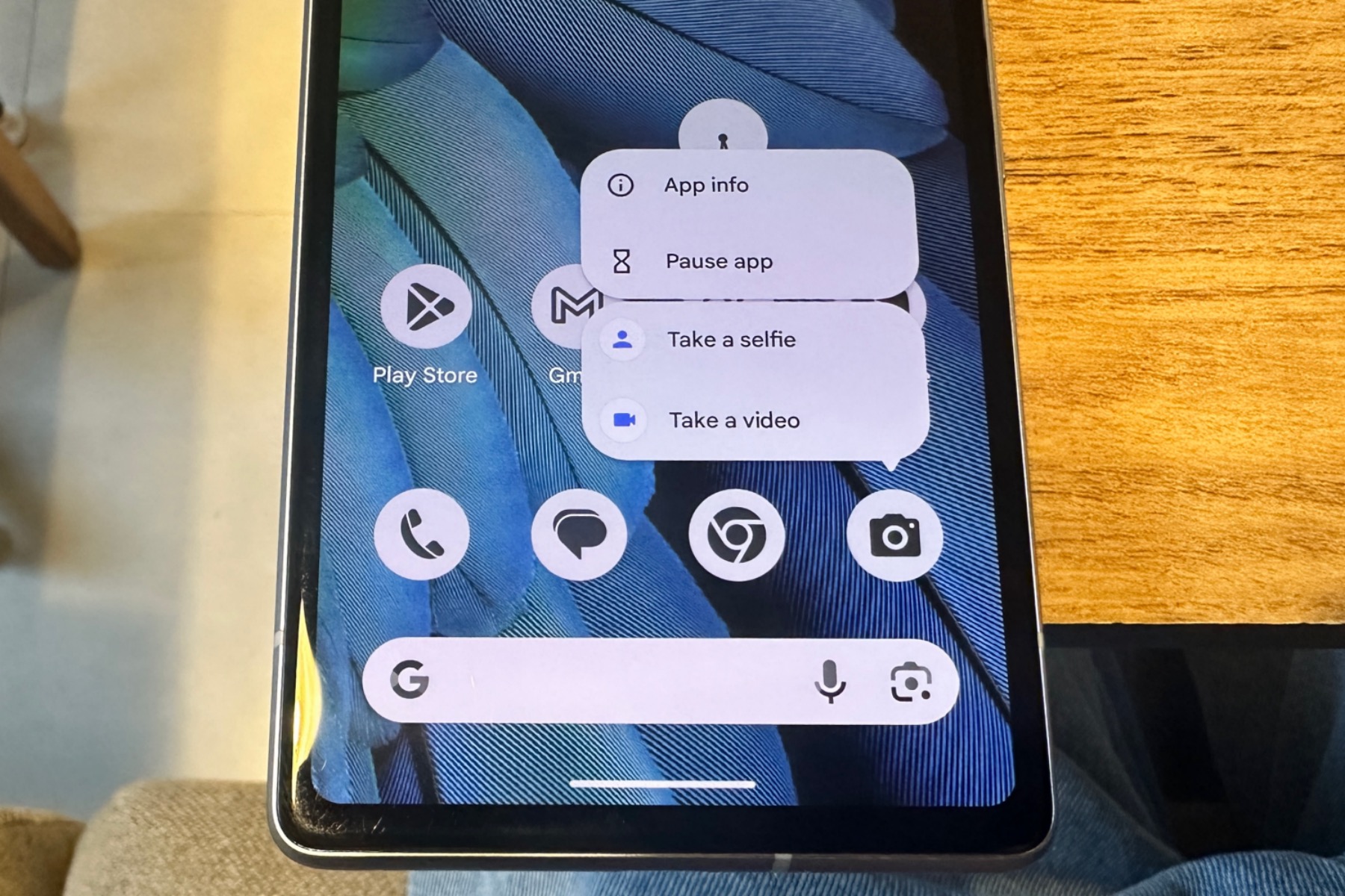
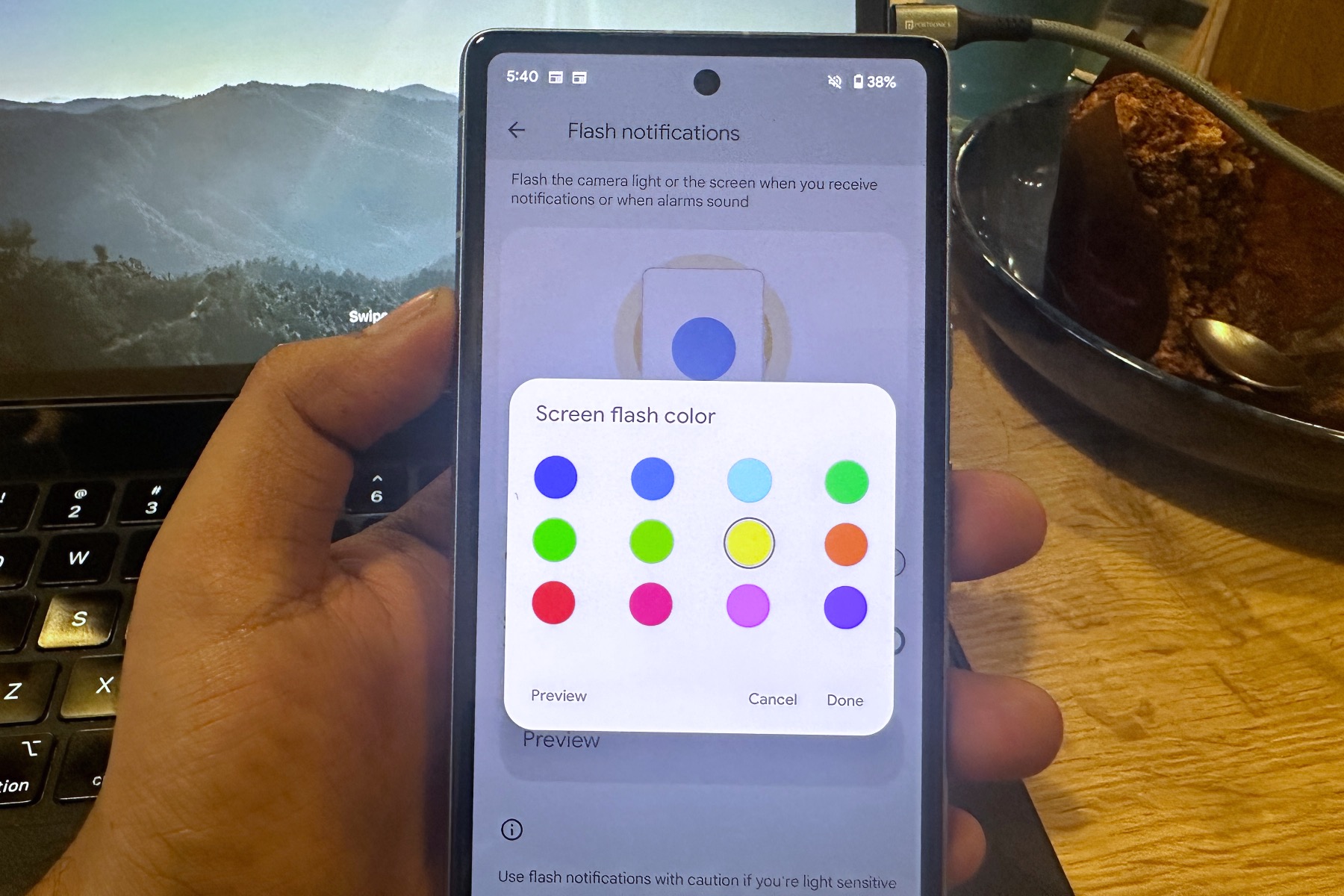
Now, when you long-press on an app’s icon, the system-level app actions (info, pause, etc.) sit in a top cluster, while in-app actions, like launching a new tab in Chrome, sit in the lower deck. If you’re a fan of turning your LED flash into a notification alert, Android 14 has got you covered there as well.
While that is convenient, Android 14 extends the courtesy to your phone’s main display as well. Just pick up a color, and the next time a notification arrives, the screen will flash in that particular hue. It’s not ideal for folks who get distracted easily, but I’m glad that it’s at least an option for the disciplined humans among us.
Great accessibility updates

Android 14 also puts emphasis on accessibility. These features don’t run as deep as what you get with iOS 17, but they certainly have been implemented well. The Magnifier system lets you pinch and zoom into any area of the screen, but you can choose if you want that kind of control or to just keep it simple with full-screen magnification.
It certainly comes in handy that you can choose between an on-screen digital shortcut, volume button press, or triple tap on-screen gesture to bring up the magnifier. There’s also a dedicated dashboard for Hearing Devices that offers a direct route for quick pairing with hearing aid devices.
To further ease access for the target audience, Google has also built in a shortcut pathway that can be triggered using the volume buttons or by tapping a persistent on-screen shortcut.

On the security side of things, Android 14 adopts Health Connect at the system level, which means it receives updates directly via the Play Store. It puts all your health data in a single place. Aside from in-house tools like Google Fit and Fitbit, it also plays well with all major third-party ecosystems such as Peloton, Whoop, and more.
The best part about the system is the sheer level of control it offers. For example, if an app collects data from six biosensors, but you only want to save heart rate data, you can disable the rest using an array of dedicated toggles. Plus, every time a health app shares your data, a notification offers a detailed breakdown of the same.
A solid start that saves more for the future

There are a few other changes that you won’t see on phones. Android 14 puts a special emphasis on how apps scale on large-screen devices like tablets and foldable phones. You can, of course, force a portrait-first app in full-screen tablet mode. Instagram, for example, looks acceptable in a landscape view.
After playing around with Android 14 for a few weeks, I have come to the conclusion that it doesn’t try to reinvent the wheel. Instead, the focus is on small, but thoughtful improvements. Interestingly,
I would gladly take this subtle refinement over an update that is heavy on features, but serves as a stuttering mess. Notably, it appears that Google has saved the best of Android 14 for the coming months with feature drops. Sadly, most of those futuristic AI-driven tricks will be confined to the Pixel 8 range due to hardware limitations.
Still, if you have a phone that gets the Android 14 update, it’s well worth downloading. It’s not a revolutionary update from Google, but it’s one with a lot of good to offer — and I think you’ll be quite happy with it.


