“The Ticwatch 2 is breath of fresh air for smartwatches with its sleek design, slick interface, and low price.”
- Brilliant display
- Slick operating system
- Stellar call quality
- Attractive design
- Low price for a smartwatch
- Tickle slider isn’t responsive or fast
- Needs touch-resistive features
- Some parts of the app and watch are in Mandarin
- Voice assistant has trouble with requests
If you’re an Android Wear enthusiast and need something to hold you over until Android Wear 2.0 is released later this year, feast your eyes on the Ticwatch 2. It runs Ticwear 4.0, an Android-based operating system built by a Chinese company called Mobvoi, which was founded in 2012 by ex-Googlers.
Mobvoi is a Google-backed company that is known for Chumenwenwen, its voice assistant and search service that’s used in apps like WeChat. This technology has also been powering Android Wear devices in China since late 2015, because Google can’t use its own services like Google Play and Google Now in the country, seeing as they are blocked by the Chinese government. Mobvoi is one of the first Chinese companies the search giant has financially backed since it left the country in 2010.
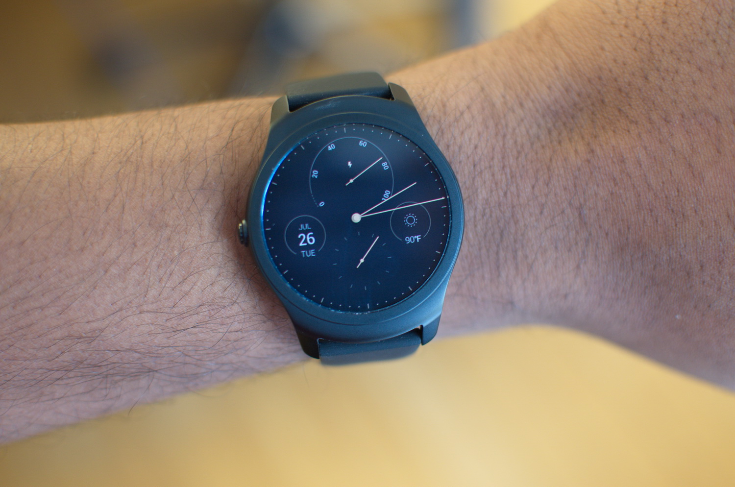
The 42mm Ticwatch 2 is one of the most comfortable smartwatches we’ve worn.
At first glance, there are a lot of similarities between the Android Wear operating system and the Ticwear software that runs on the Ticwatch 2. The Chinese OS is a ROM that people in China can use to replace
The Ticwatch and the Ticwatch 2 have already been released in China, but the latter is now available worldwide via a Kickstarter campaign that launched on July 26 — the company reached its $50,000 funding goal in 10 minutes and has surpassed $350,000 in funding. While the hardware is more or less final, the software is still in development, so things can improve and change by the time the device ships to its first backers in September. Again, we received a prototype unit and we will update this review when the final product launches later this year. We’ve been using the Ticwatch 2 for a while to see how it compares to Android Wear watches, so let’s dive in.
Small, sleek, and elegant
The 42mm Ticwatch 2 is one of the most comfortable smartwatches we’ve worn. We tested the one with a black silicone band, which is great for active wear, though it looks elegant at the same time. Still, if you want a more high-end look, you can always choose the brown leather or black stainless steel versions, which are more expensive.
Slipping it on is easy, and you’ll find the crown on the center-left side. What’s neat is that you can wear the watch however you like — on your left or right hand — with the crown facing either side, thanks to wearing preferences in the Settings menu. The OS will adjust to your preferences.
The 1.4-inch OLED screen has a brilliant resolution of 400 x 400 pixels, with a pixel density of 287 pixels-per-inch. It’s an excellent screen with vibrant colors, deep blacks, and a bright light. There’s an ambient mode that makes the screen monochrome and a little dim to save battery, but the best part about the display is that it’s fully-circular — meaning there’s no flat tire like there is on the Moto 360 or the Casio WSD-F10.
Our only issue with the display is that when the watch is in ambient mode, it’s too easy to activate and various screens and apps open up when it comes into contact with your skin, like when you cross your arms. It’s annoying because we had to constantly press the crown, or put our palm to the watch face to set it back to ambient mode. This watch sorely needs some touch-resistive features.
Display aside, there’s also one slick function that’s hidden within the design of the Ticwatch 2 — Tickle. It sounds funny, pun intended, but you essentially are tickling the right side of the watch to scroll through menus quickly, adjust the volume, and more. The strip, which was visible in the original Ticwatch, acts similarly to the rotating bezel on Samsung’s Galaxy Gear S2 — all you have to do is move your finger up and down to interact with the screen without having to touch it. You just have to tap it once to select the highlighted option.
Tickle didn’t work flawlessly all the time, and it doesn’t even work on some of the pre-installed apps. It was often faster to touch the screen to navigate rather than using the strip. It’s a neat idea, but the Ticwatch needs to be more responsive and allow for faster scrolling to be useful.
A pre-cursor to Android Wear 2.0
The Ticwatch 2 is how Android Wear should have started out. It’s packed with a built-in GPS, a heart-rate monitor, 4GB of internal storage, a microphone, and a speaker. You can answer and make calls, as well as respond to texts and instant messages. Call quality was stellar for a watch, but we couldn’t get over how odd it was to talk to our wrist.
While the disadvantage for burgeoning watch operating systems is that there are few apps, that’s not a problem for Ticwear. Since the OS is Android-based, all you have to do is connect it with your phone via the Ticwear app and then download the Android Wear app to connect it to the framework. That way, all
The OS itself is fairly smooth, but there are occasional hiccups where you may have to perform an action twice for it to register. The watch also can be laggy, but it’s infrequent. Unfortunately, the lag may be due to the dual-core MediaTek processor and 512MB of RAM powering it instead of the software. If the processor isn’t powerful enough, that will hurt the watch’s chances.
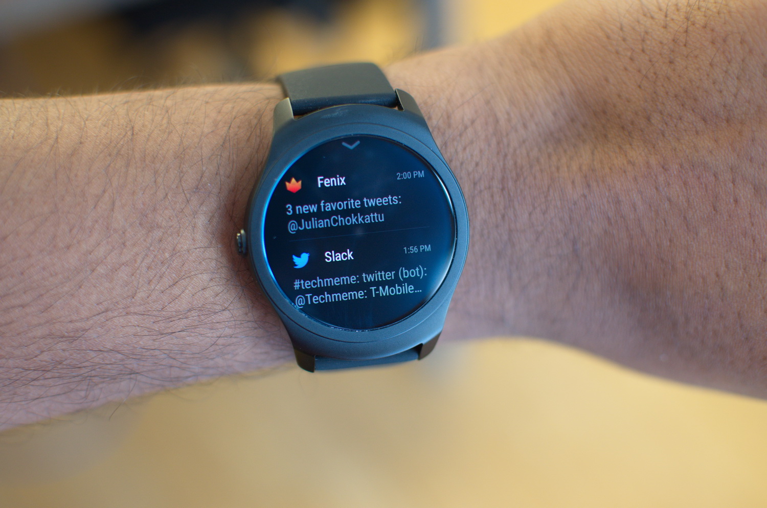
In terms of design, the user-interface is sleek and well made. It’s better looking than Android Wear, at least where notifications are concerned. Where Google opts for a bright, white theme for the OS, Ticwatch goes black, which is not as harsh on the eyes and less distracting. Of course, that changes with
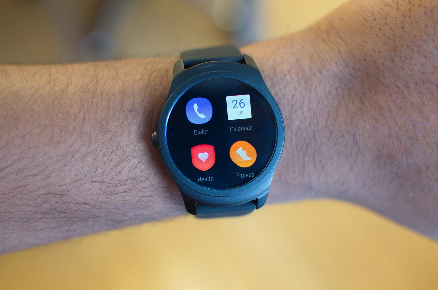
Ticwear 4.0 is based on multi-directional swiping, something that Google is moving away from in Android Wear 2.0 — the upcoming update makes the OS navigation more vertically streamlined. Still, Ticwear is incredibly easy to use and understand from the get go. Swipe to the left to access pre-installed apps like the Dialer, Calculator, Calendar, Fitness, Recorder, Timer, Alarm, and more.
You can access the Mobvoi AppStore via the Ticwear app — but it’s in Mandarin, so it wasn’t helpful. The Kickstarter says users will be able to “download more Ticwear apps through the Ticwear App Store,” and Mobvoi told Digital Trends that an English version will arrive when the watch launches.
Swiping right, or saying “OK Tico,” activates a Google Now-esque voice assistant. It basically runs Google searches, but you can ask it to perform functions like calling or texting your contacts, setting reminders, or asking it the weather. The assistant is mainly useful for performing those types of actions — using it for voice search is useless.
We asked, “How old is President Barack Obama,” and the first result would be Obama’s Wikipedia page with an option to open it on the phone. On an Android Wear watch, Google pulls the relevant information you’re asking for so that you can see it immediately on the watch. Ticwear can still do that, but it’s limited to a few, specific questions.
On the topic of the voice assistant, we noticed that many sentences it produced weren’t grammatically correct. The OS also had similar errors. One notification occasionally crops up in Mandarin, and the entire Help section in the Ticwear app is also in the Chinese language. Mobvoi assured us that a perfectly tuned English version will be available at launch. Other languages will follow, though Mobvoi didn’t give us a timeline for when languages beyond English would be supported.
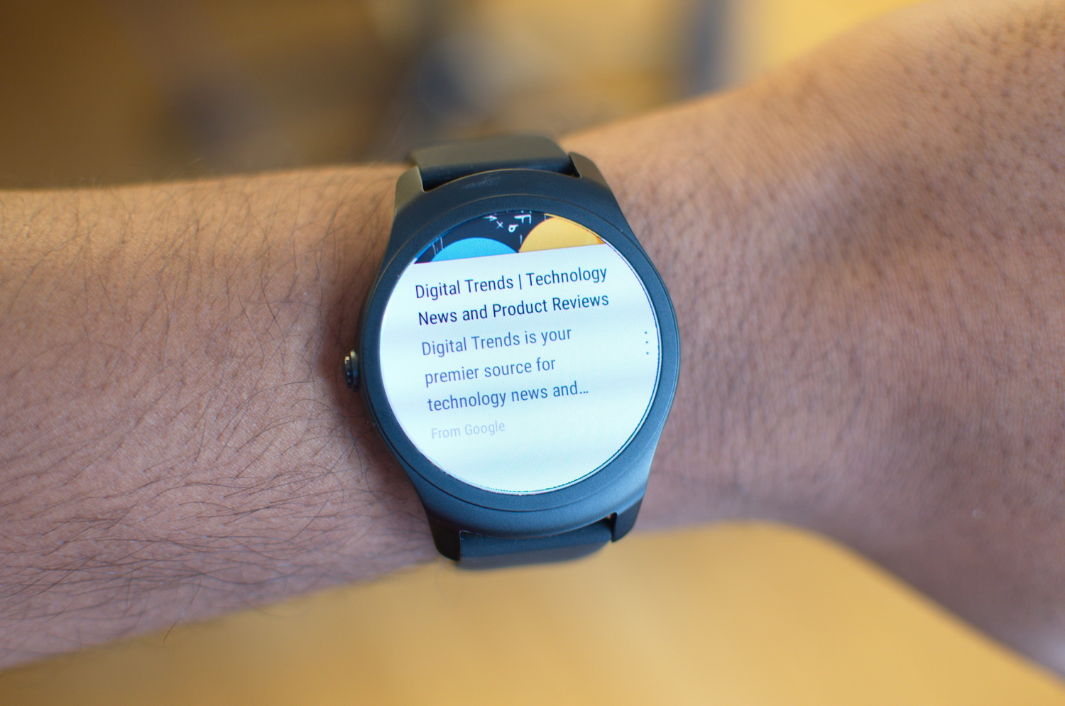
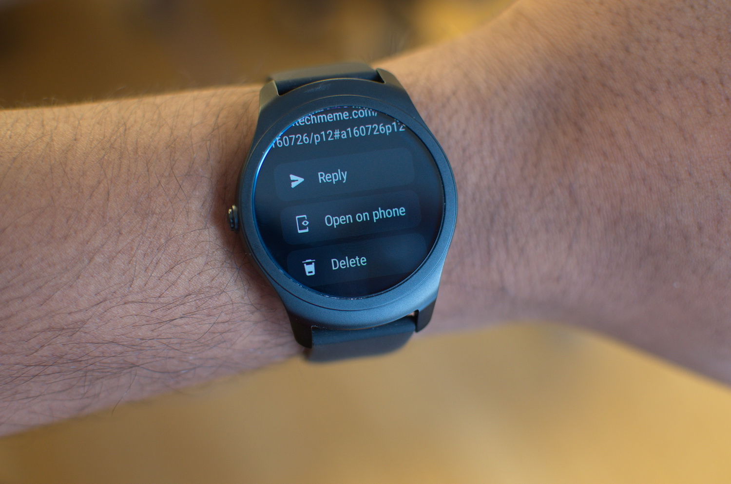
The rest of the OS navigation is straightforward. Swipe up, and you’ll find the notification hub. Here, you can tap on notifications to interact with them, or swipe them away. Because Ticwear accepts Android Wear apps, it’s easy to respond to messages from apps like Facebook Messenger — just use the voice input, or select from preset phrases. You can only customize these default replies for SMS, which is unfortunate, because it would be nice to be able to add a few more for all messaging apps. A lot of these actions are a lot more user-friendly and intuitive than what is available currently on
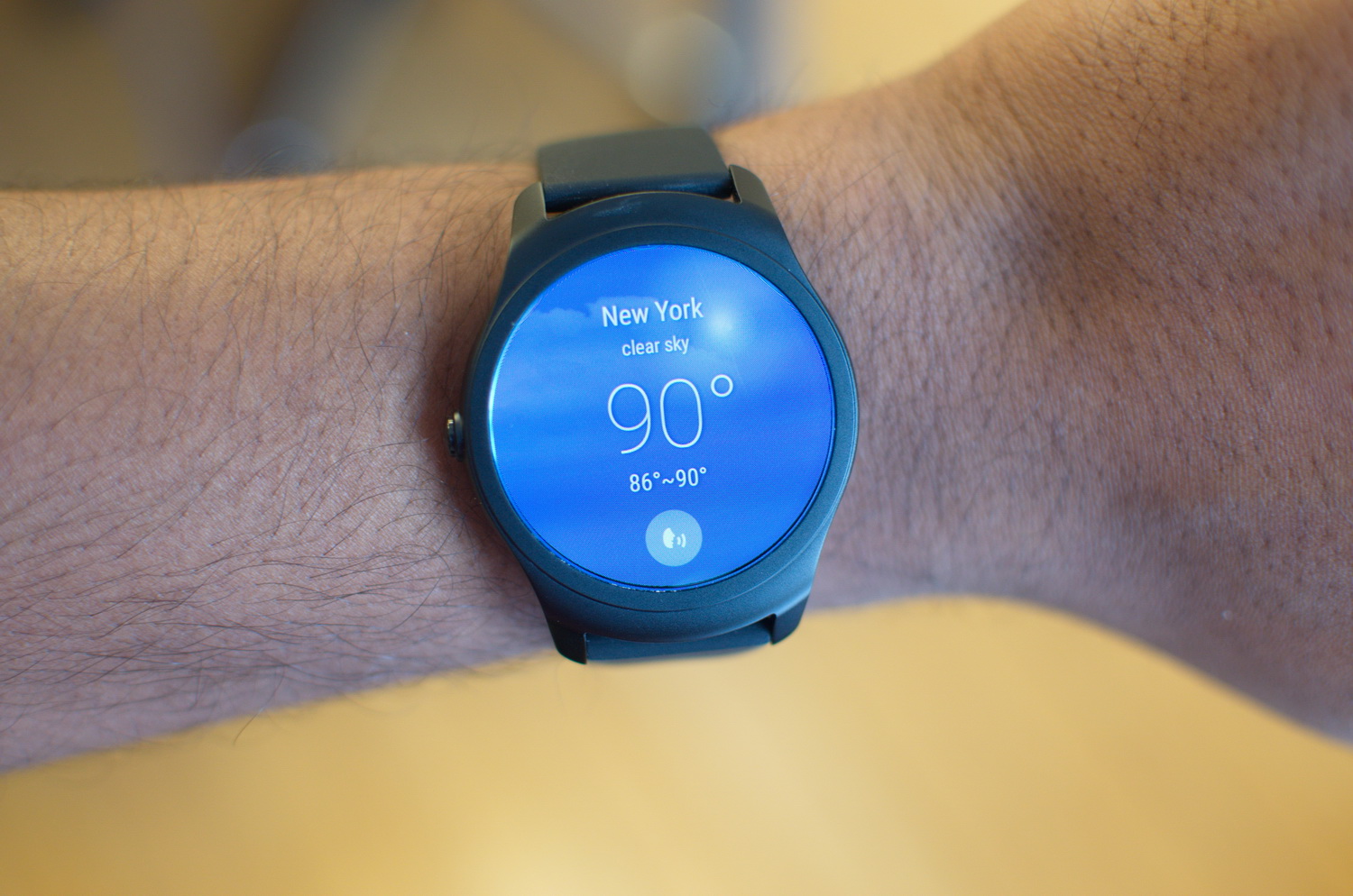
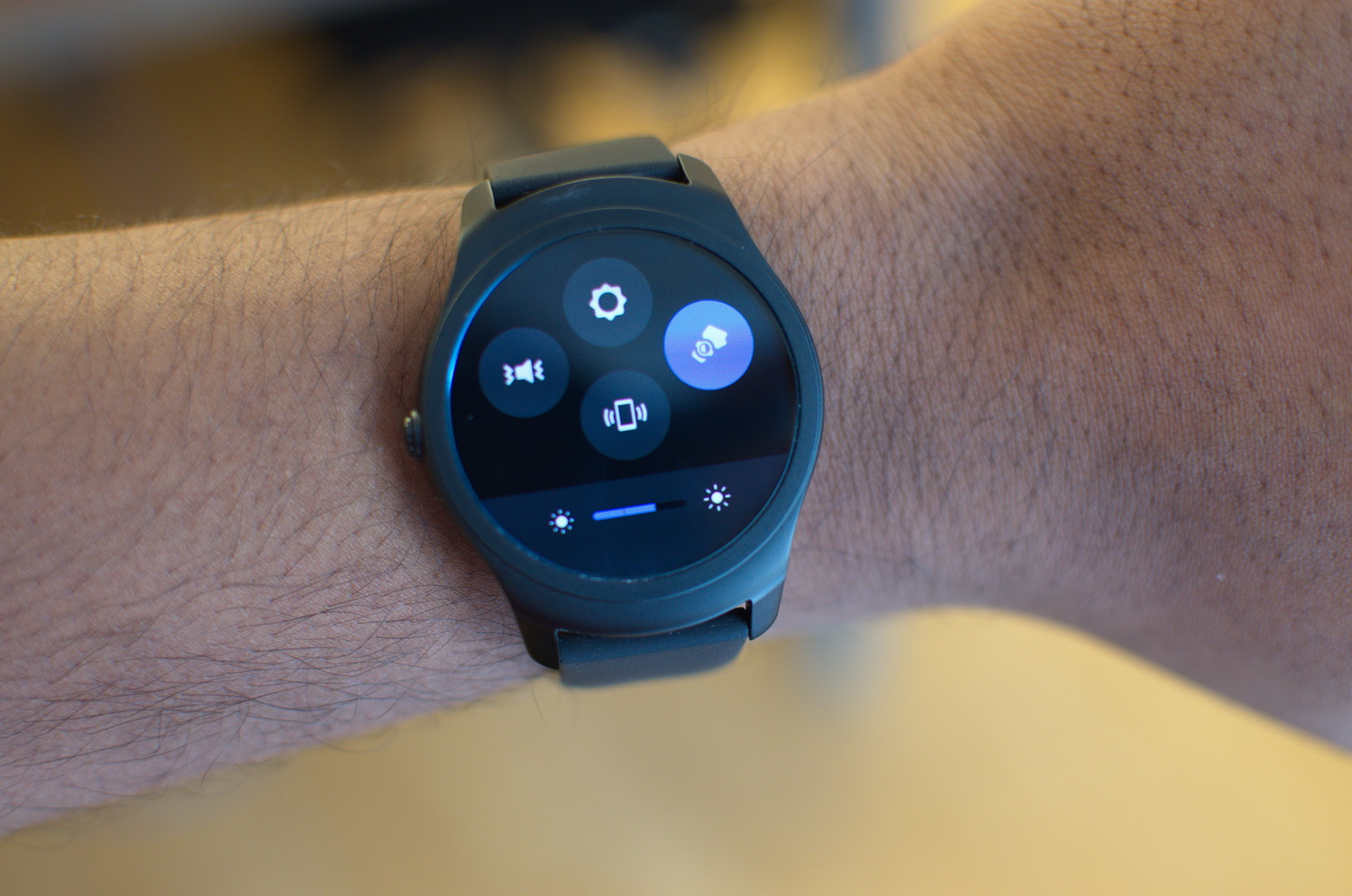
Finally, swiping down from the watch face gives you several various “Quick Cards” to scroll through. It takes a little bit to get used to, but you’ll see watch settings, the weather, music controls, a step tracker, and network settings. They’re all self-explanatory, and you can open up the weather app and the Fitness app in these respective screens. You can arrange the way you want these screens displayed in the Ticwear app.
Supplementary features
Ticwear also attempts hands-free controls with gestures, and they’re mostly the same ones from Android Wear. Place a palm on the watch to switch it to ambient mode; lift your wrist and look at the watch to wake it; twist your wrist twice to answer a call; and flick your wrist up and down to either pull down the settings menu or pull up the notification hub. The latter is a little difficult to pull off quickly, so you’re better off just using your fingers.
The Ticwatch 2 is a gamble, and we recommend you think long and hard before you back it.
The device also supports iOS, but the features are much more limited than what you’d find on Android.
You’re supposed to be able to add music to the watch — that’s what the 4GB of music is there for, but we haven’t been able to figure out how to download it to the device. There’s no music app pre-installed on the watch, and any instructions are only written in Mandarin.
Features like the GPS are only useful if you trigger an activity, like an outdoor run, in the Fitness app on the watch. Even then, you will only be able to see your data, including your GPS tracking, via the Ticwear app.
The Health app is a little more useful, allowing you to monitor and see your heart rate data, get sedentary reminders, as well as immediately glance at your steps and distance traveled over the past week. You can sync your fitness data with Google Fit, which is a plus, but other services would be welcome.
But what about looks? Swapping out watch faces is the same as changing it up in Android Wear, but the options are limited. Again, the app leads you to the Mobvoi App Store if you want to download more, but it’s in Mandarin for now.
The 20mm bands are easily swappable thanks to a snap feature on the bottom — they’re quite similar to Android Mode, which allows wearers to “snap-and-swap” bands.
It will last you more than a day
We’ve managed to come home with about 30 percent remaining after moderate usage on a typical workday. That’s better than what we’ve experienced on the 2nd generation Moto 360, which has the same 300mAh battery on the 42mm variant of the Ticwatch 2.
Thankfully, you’ll find a charging cradle that’s quite similar to the Huawei Watch. It’s slightly magnetized, so you can plop the device down to charge. When charging, the watch displays almost the same exact charging digital clock animation as on Android Wear.
Kickstarter
Mobvoi is first selling the Ticwatch 2 on Kickstarter at lower prices, and it’s the low price tag that really makes this watch shine. The super early bird package gets you the silicone strap variant for a measly $100. The Kickstarter special for the same version costs $160. It will retail for $200.
The most expensive version — the stainless steel one — costs $150 for the Super Early Bird, and the Kickstarter special will set you back $200. It will retail for $300.
There are more to choose from, and you can check them out here. The devices are expected to ship by September.
Conclusion
The Kickstarter prices make the Ticwatch 2 sound like a great deal. Most Android Wear watches will run you $250 or more, and the Apple Watch starts at $350. The Ticwatch 2 brings a breath of fresh air to the smartwatch market at a time when both
But the Ticwatch 2 is a big gamble, as all crowdfunded campaigns are. It is on Kickstarter, and while it has been funded the device may be delayed; it is from an unknown Chinese company whose devices seem most practical for use in China where Google’s services don’t exist; and it is a non-mainstream operating system, which means we don’t know when it will get updates, or if it will be supported in the long run — the company says it will.
If you’re a tech geek who just wants to try out a different smartwatch OS and you like the look of the Ticwatch 2, it may be worth the gamble. However, if you just want a smartwatch that will work from a brand you can trust, we recommend waiting for the next generation of Android Wear watches or the Apple Watch 2, both of which should arrive in late 2016 or early 2017.
We sincerely hope the Ticwatch 2 succeeds as it is a fresh take on the smartwatch. We hope many of our current grievances with Ticwear are fixed during the Kickstarter campaign — especially considering the software is still in development and we reviewed a prototype unit. However, at this point, we recommend you think long and hard before you purchase the watch.


