Oppo makes great hardware, but the company’s software often leaves a lot to be desired. I’ve bemoaned it for a while, and I was often glad to swap the SIM out of an Oppo review phone once I was done evaluating it. Oppo has heard this criticism, and it’s changing course. Color OS 7, its latest user interface built on Android 10, looks promising, and the new Reno 3 Pro is the first Oppo phone I’ve used with it on board.
Here’s why it’s a serious improvement over previous Oppo software.
Color OS 7 is much improved
At first glance, the differences between Color OS 6 and Color OS 7 are subtle. It’s only when you start using the software that the improvements become obvious. It’s cleaner, more minimalist, and less needlessly colorful. It’s more spacious, creating a modern, pleasant interface that works well but has just enough character to look sleek.
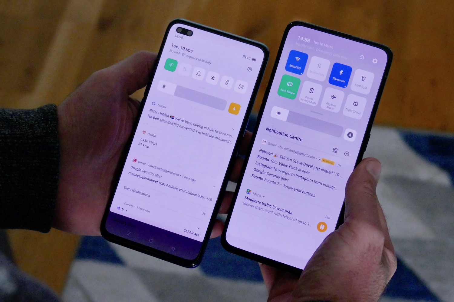
Take the notification shade, for example. In ColorOS 6.1, seen here on the Oppo Reno 2, the quick-access buttons at the top are too big, and are in different colors. In ColorOS 7.1 on the Oppo Reno 3, the icons are smaller and, when active, simply glow green. If they’re unavailable, they’re grayed out. The clock occupies a clean space, with the day and date clearly marked below. In ColorOS 6.1, this information is squeezed along the top.
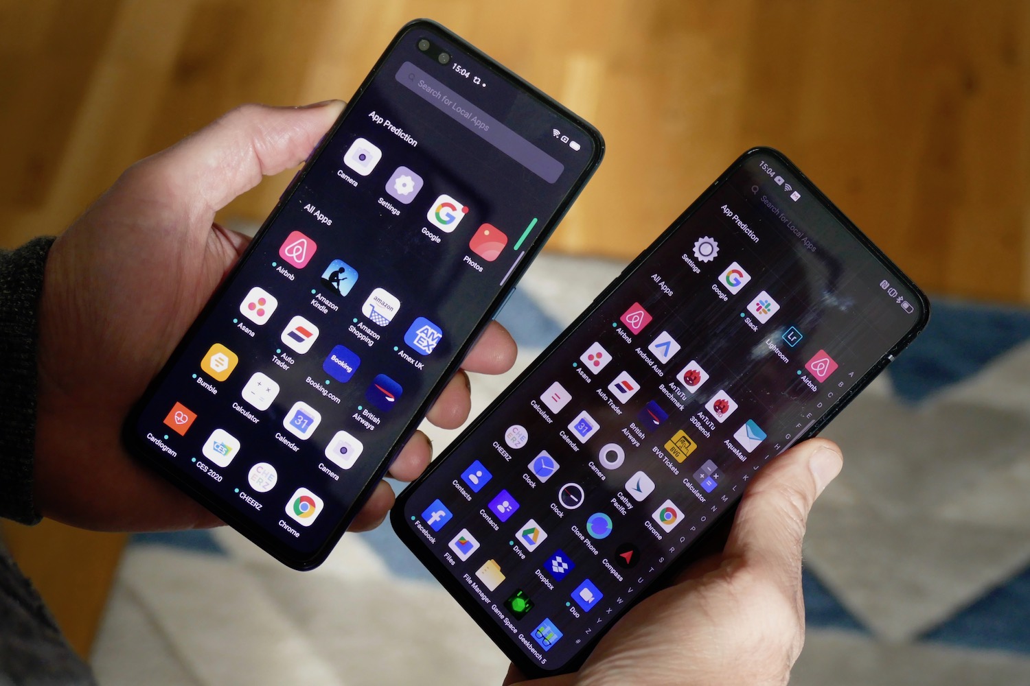
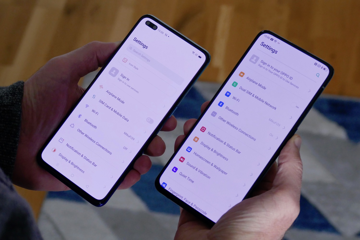
In ColorOS 6.1, the “notification Center is needlessly labeled the notification center, though its purpose was obvious because of the notifications it displayed. Design quirks like this are solved by Color OS 7.1. Under the Settings menu, many unnecessary lines have been stripped away, the icons are minimalist in their design, and the softer font makes it easier on the eye. On the home screen, the icons are all flat, rounded squares, which create a more cohesive design than the mishmash of square and circular icons in ColorOS 6.1.

On the Reno 3 Pro, Color OS 7.1 is smooth and fast, without any of the visual glitches or needless animations seen in older versions of ColorOS. It’s clearly engineered to work well with MediaTek’s new Helio P95 chip, which powers the phone, and makes good use of its 8GB of RAM for smooth performance. Notifications arrived more reliably than previous ColorOS-powered phones, Android 10 gestures are great, and dark mode looks brilliant. I like many of the wallpapers, too.
It’s not perfect, however. Oppo has a video-editing suite called Soloop, but it’s a separately installed app that’s not built into the photo editor in the Gallery app. It’s one of only a small selection of pre-installed apps on my review device. The Smart Assistant, swiped in from the home screen, is complicated to set up — you have to subscribe to modules using a series of deep menus — and largely useless when you’ve done so. I just prefer a simple news feed.
Is Color OS 7.1 perfect? No, but it’s a positive change from older versions of Oppo’s software, and much easier to live with each day.
The Reno 3 Pro’s cameras
Despite the focus on software, Oppo hasn’t let the Reno 3 Pro’s cameras fall to the wayside. There’s a dual hole-punch camera on the front, with one lens boasting a massive 44 megapixels, and a quad-lens beast of a camera on the back. Remember, the Oppo Reno 3 Pro is a mi-range phone with a price tag of around $420. Its camera hardware is a great value.

Around back is a 64-megapixel f/1.7 main camera, a 13-megapixel f/2.4 telephoto camera, an 8-megapixel f/2.2 ultrawide, and a 2-megapixel depth sensor. On the front, the 44-megapixel camera sits alongside a 2-megapixel depth lens. I’ve been using the Reno 3 Pro both with prerelease software and after a large update following its announcement.
I loved some shots it took both before and after the software update. The wide-angle mode has improved considerably, with more color and better exposure. However, I saw some inconsistencies. Some photos can appear washed out and lifeless, and while portrait mode has effective edge recognition, the macro mode is slow and unreliable. It doesn’t take good close-up shots at all.
Selfies are sometimes a little soft, especially in bright light, but the secondary depth-sensing lens provides superior edge detection. The beauty mode is activated as standard, but isn’t too aggressive unless you go into the setting and start playing with the image. The Reno 3 Pro can take stunning photos, and there’s plenty of versatility with a dual-lens selfie cam on the front and a wide-angle, 2x, and 5x zoom on the back.
What about the rest of the phone?
The design is reminiscent of the Huawei P30, right down to the eye-catching color on the back panel. However, the Reno 3 Pro is made of plastic, not glass. That lowers the weight but cheapens the feel. Inside is a 4,025mAh battery with Oppo’s VOOC charging. It’s not as fast as Super VOOC on the Reno Ace and new Find X2, and will instead charge up to 50% in about 20 minutes. It takes at least an hour to reach full charge. With moderate use, the battery lasted two days without a problem.

I like the 6.4-inch AMOLED screen’s colors, and the 20:9 aspect ratio makes it easy to hold and use with one hand, much like the OnePlus 7T. The Reno 3 Pro’s face unlock is fast — thanks to the dual-lens setup. There’s a reliable in-display fingerprint sensor, too., however, I almost never used it because the face unlock is so quick and works from some pretty serious angles.
Price, availability, and conclusion
Oppo has announced the Reno 3 Pro for India, where it costs approximately $420. It’s also expected to see a wider release, potentially in the U.K. and other parts of Europe. An official release in the U.S. is unlikely, but it can be imported. When looking, watch out for the China-only Reno 3 Pro 5G, which is a different phone entirely.
Oppo’s Color OS 7 final breaks away from the older versions of the software, changing it to something international owners will find more familiar. It’s an important shift, as Oppo continues to take advantage of its ability to run Google apps and services, while competitor Huawei cannot. With this problem solved, is the Reno 3 Pro worth your attention?
The Oppo Reno 3 Pro must compete with phones like the Google Pixel 3a (and probably the Pixel 4a soon, too), the Asus Zenfone 6, and the Realme X2 Pro. All cost around the same price and have great cameras and strong software. The Reno 3 Pro is much closer to a proper competitor than previous Oppo phones. However, the cheap-feeling body and inconsistent camera performance lets it down, and it can’t quite be saved by the long-lasting, fast-charging battery.


