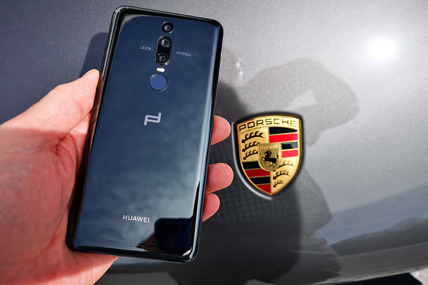
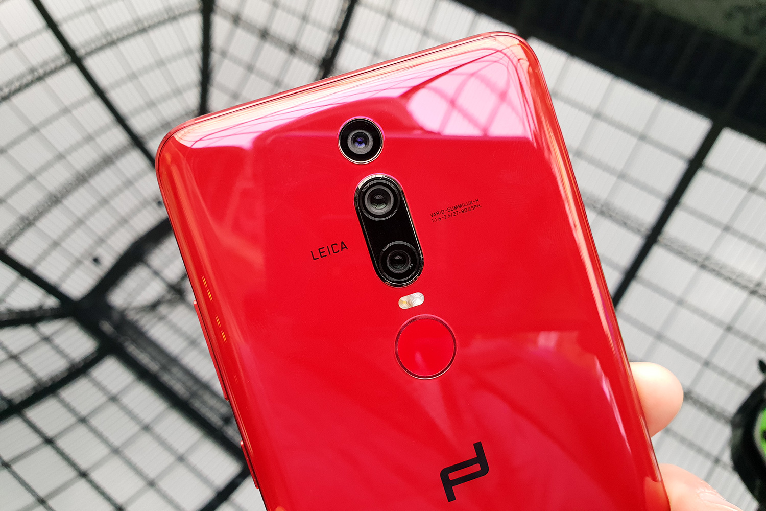
It’s very easy to dismiss the $1,880-plus Porsche Design Huawei Mate RS as an expensive smartphone with flashy branding; but that would do it considerable injustice. To understand why, you’ll need to understand Porsche Design’s philosophy: For it to be anything less than 100 percent involved in a project would be unthinkable. We spent some time at the company’s headquarters in Zell am See, Austria, to find out just how deep Porsche Design’s DNA runs in the Mate RS, a sister device to the Huawei P20 Pro.
Huawei chose to partner with Porsche Design because it understands that while it can design phones itself, there are other companies out there that can do it even better. Huawei chose to work with Porsche Design for the third time in its history. In a conversation with Digital Trends, Porsche Design’s Design Director, Christian Schwamkrug, called this project “the most intense,” as they had discussions on every little detail, right down to the amount of mirroring on the rear panel.
No notch
One thing was very clear from the start. Porsche Design is not a company that does things by half measures, and it isn’t going to put its name to a product without having considerable say in how it looks and performs. That doesn’t mean the partnership was tense. Quite the opposite.
Porsche Design is not a company that does things by half measures.
“From the very beginning onwards, we were on one level, with one design approach, and this is why the end result is so perfect,” Schwamkrug said.
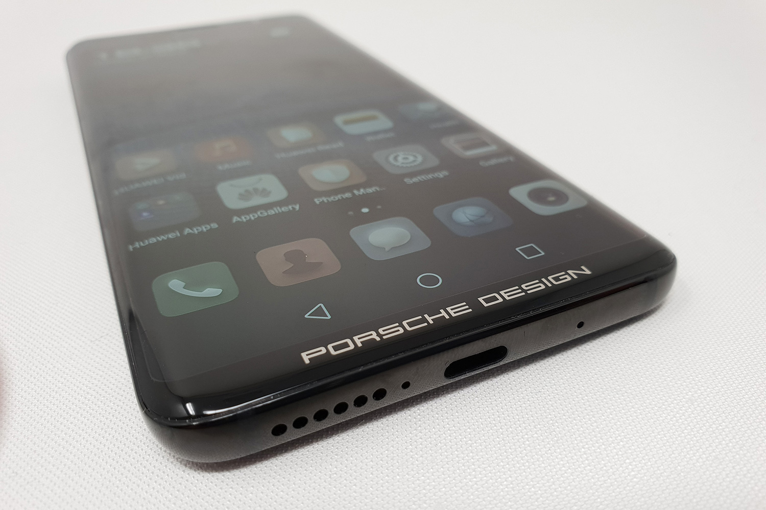
One of the most striking visual differences between the Mate RS and the P20 Pro is the screen design. The P20’s screen notch is missing on the Mate RS, as the latter opted for a 6-inch OLED screen that’s curved at the edges, but conventionally flat along the top and bottom. A major smartphone trend at the moment, the notch didn’t win over Schwamkrug, who made his personal feelings very clear.
“When I saw the notch for the first time, I nearly couldn’t believe it. It’s disturbing, from a design philosophy,” he said. “A picture is either rectangular or square, with a border line, and a clear frame format. I like symmetry. I didn’t want to have the notch, I think it’s a compromise.”

Why? It’s an excellent introduction to the company’s entire design aesthetic, which can be summed up by a famous quote from Ferdinand Porsche: “If you analyze the function of an object, its form becomes obvious.”
It’s so much a part of Porsche Design, it’s printed on Schwamkrug’s business card. The notch, in terms of design, goes entirely against this philosophy. The Mate RS has a screen that looks like a screen, and that’s that.
Clean design
Who is Porsche Design?
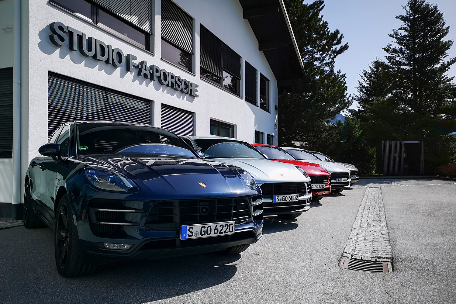
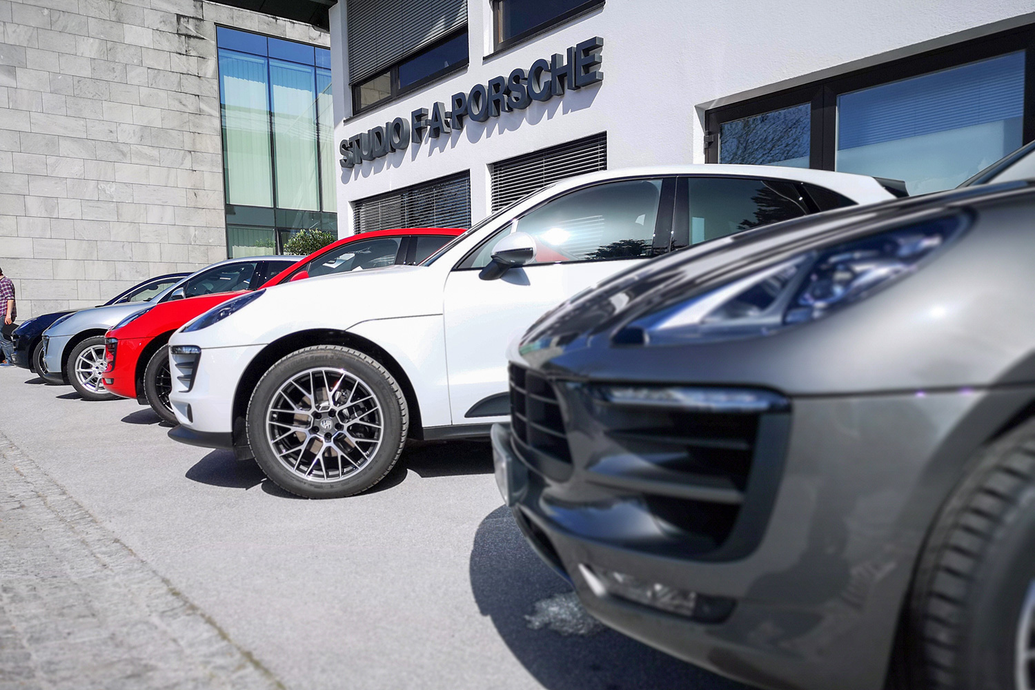
Founded in 1972 by professor Ferdinand Porsche, Porsche Design is a design and innovation group with its headquarters in Zell am See, Austria. Although it has its own range of products, including watches and clothing, its primary business is designing products for other companies. While it’s not the same company as Porsche cars, it has the same values as the famous automotive brand, and in honor of Ferdinand Porsche, it keeps his office the same as the day he left it.
To better understand Porsche Design’s approach to design, look no further than its P’3310 pencil. The minimalist stainless steel body compresses to extend the lead, in a stunning, eye-catching fashion. It looks great, it operates in a distinctly unique way, it’s a uniform design, and it’s instantly obvious what it does. Look for similar aspects in all Porsche Design’s products.
Porsche Design knows what looks good, and it’s not one for backing down. We were told a story about Porsche Design’s original involvement with LaCie (now a part of Seagate) and the development of a portable hard drive. The edge of the simple rectangular drive was chamfered and had polished edges. LaCie deemed this unnecessary and pushed for it to be removed. Porsche Design said, essentially, it would walk away from the project if it wasn’t. The polished edge stayed. Porsche Design gets what it wants.
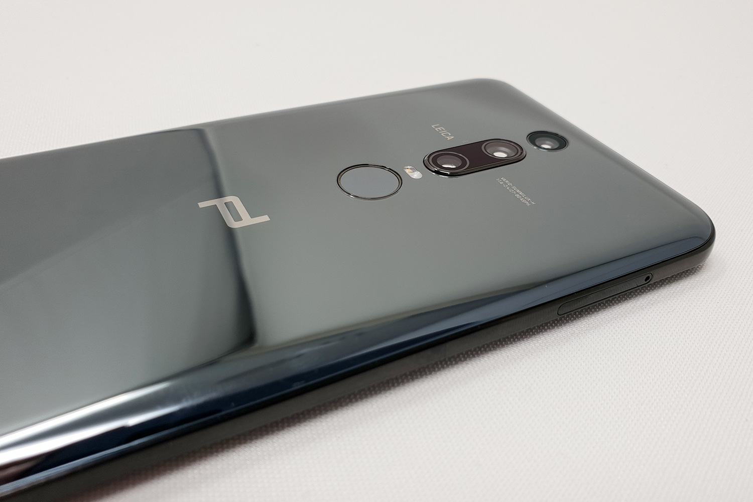
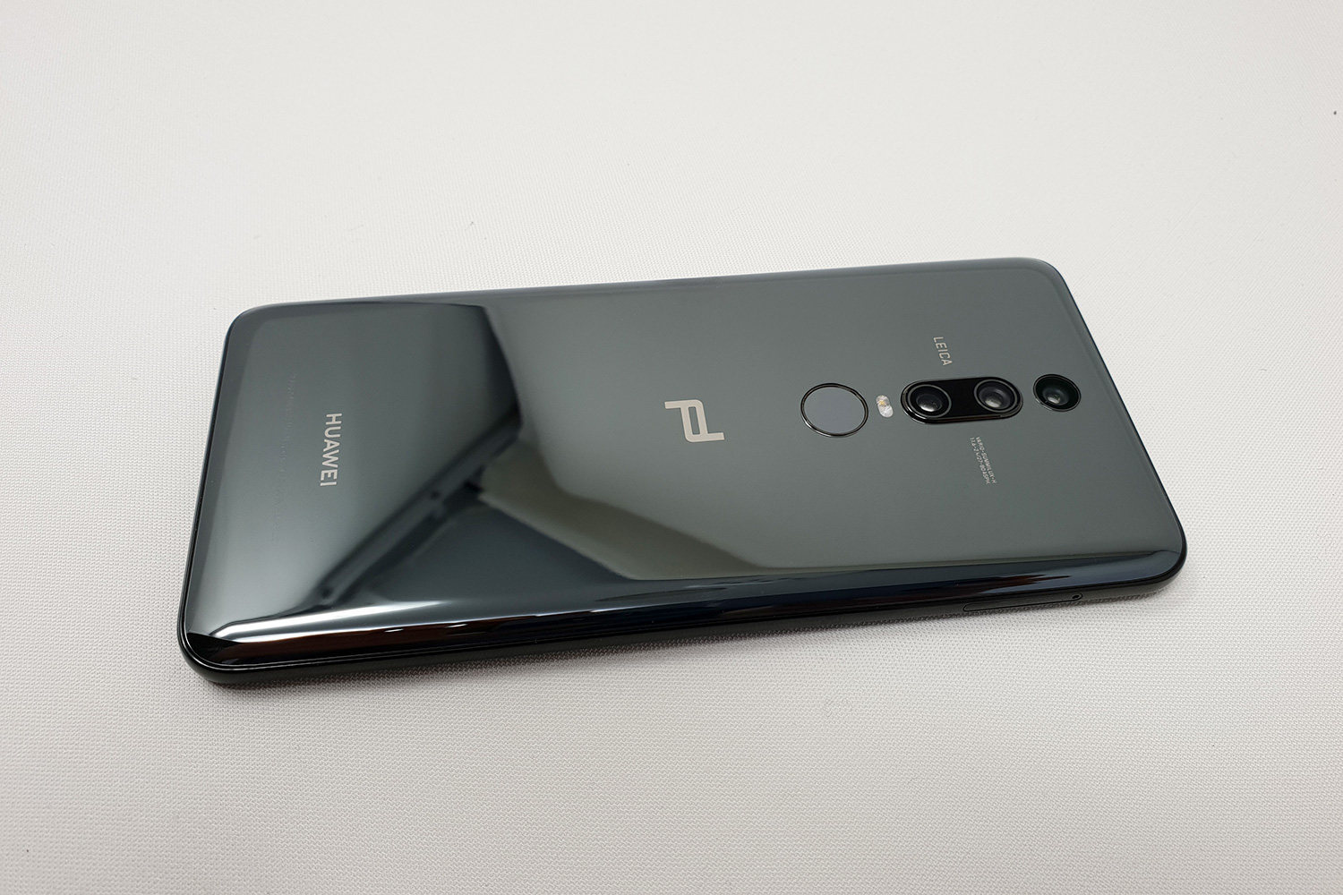
Or does it? It may depend on whether usability is impacted by these design choices. For example, there are two fingerprint sensors on the Mate RS — one on the back under the camera lenses, and the other under the display on the front. Arguably, it really only needs one; but Porsche Design prides itself on designing products that are as much about performance as they are style. Having one of the first in-display fingerprint sensors perfectly aligns with this, and its love of clean design. But as Huawei’s senior product marketing manager Peter Gauden explained:
“Being such a new technology, the in-screen fingerprint sensor may not be the technology people feel the most comfortable with. So, as it lends itself to the symmetry on the back of the phone, the inclusion of the rear mounted sensor still makes sense. When we look at it from a usability perspective, it works really well.”
Porsche Design still got its way, but not at the expense of the user experience, which would also clash with the company’s strong ideals.
Technology firsts
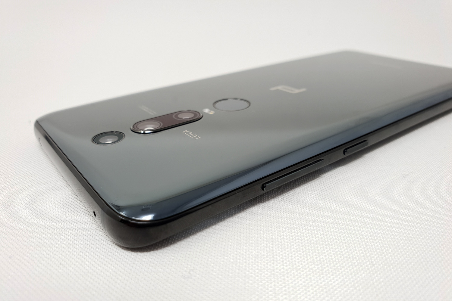
Huawei and Porsche Design also pushed the boundaries in other areas of the Mate RS, with three aspects not seen in smartphones before. The in-screen fingerprint sensor is a first for an internationally available phone; there’s a whopping 512GB of storage space inside — the first we’ve seen on a phone; plus the latest temperature-reducing technology used by the aerospace industry to keep the phone cool. That’s before we get to the 8-angle curved body, which although Schwamkrug accepted the comparison with the Samsung Galaxy S9, he said “the Mate 10 RS is more refined.”

Schwamkrug didn’t look favorably on the camera lenses being placed on the side of the phone either, and wanted the visually-natural symmetry of centrally-stacked lenses. Huawei wants the P20 Pro to resemble a camera. To Porsche Design, the camera bumps are also warts on its beautifully-perfect design, and had the technology been there, it would have preferred to hide the camera lenses under the mirrored rear panel so they couldn’t be seen at all. One for a future Porsche Design phone, perhaps.
Porsche Design’s involvement isn’t only seen on the surface either. In fact, the inside of the phone is where the design starts, as it often dictates how the exterior will look. The team additionally gets deeply involved with the software, the size of the icons, and the fonts used for text. This is not a badging exercise, done purely for profit. You’re getting a phone genuinely crafted by the famous design house, and it wants people who understand its philosophy to see and feel that in the end product.
Cash at the ready?
Does that mean you should rush out and buy it over the P20 Pro? Not necessarily. Despite Porsche Design’s sleek styling, more storage, and no notch, it’s not really worth the extra money unless you’re a true Porsche Design devotee, and go weak at the knees for its attention to detail and unerring commitment to a clear and focused design language.
Porsche Design and technology
Porsche Design has a long history of designing products for technology companies. PD has made everything from landline phones for Samsung to vacuum cleaners for Panasonic, along with headphones for Kef, and hard drives for LaCie. It has even made a laptop under its own name.
Huawei isn’t the first smartphone manufacturer it has worked with either. Before this, it produced versions of BlackBerry phones between 2011 and 2014, all aimed at rich business folk who didn’t fancy owning a regular BlackBerry phone. The Bold inspired P’9981 started the line, the P’9982 was similar to the Z10 touchscreen phone, while the P’9983 reworked the Q10. Check out the familiar PD design aspects — the symmetry, the straight lines, and the clean finish.
It has made three phones with Huawei: The Porsche Design Mate 9, the Porsche Design Huawei Mate 10, and the Porsche Design Huawei Mate RS, plus the Porsche Design Huawei Watch 2. Expect more to come too, as the two companies said this is a long-term partnership.
The P20 Pro is far from being an ugly duckling too, with the blue and purple “twilight” color scheme easily matching the red Mate RS for visual punch. The two also share the same excellent triple-lens camera system. The in-display fingerprint sensor may be technically cutting edge, but it is a misstep, at least based on our early experience with the phone. It isn’t as reliable as the rear sensor because it’s a little slower, and requires some effort to “learn” how it likes to be used. We don’t want that from a security system.
The Porsche Design Huawei Mate 10 RS is still a wonderful thing though, and an example of Huawei seeking out high-quality, confident partners that genuinely enhance its products. Schwamkrug called the Mate 10 RS a, “no compromise” device, adding that, “everything you see is Porsche Design DNA,” hammering home the phone’s exceptional pedigree. By not bending to Huawei’s will on the screen, not compromising on the fingerprint technology, and building in its signature styling details, the Porsche Design Mate RS is a true luxury Porsche Design product.
There’s a reason the Mate RS looks the way it does and why aspects differ greatly from the P20 Pro. By understanding what they are, and why Porsche Design is so committed to its vision, parallels can be drawn between how the Porsche 911 car has altered over its lifetime, and the gradual evolution of Porsche Design’s Huawei phones. Both products crucially and rigidly adhere to that famous quote from Ferdinand Porsche, that so obviously continues to shape the company’s products no matter what they are.
