Details about Samsung’s upcoming foldable phone may have stolen the show at the Samsung Developer Conference keynote, but Samsung had some other news to show off. Namely, the company took the wraps off of a new Android skin for its phones going forward. The new skin is called One UI and apart from the sweet visual aspects it has on offer, it could make using your phone that little bit easier.
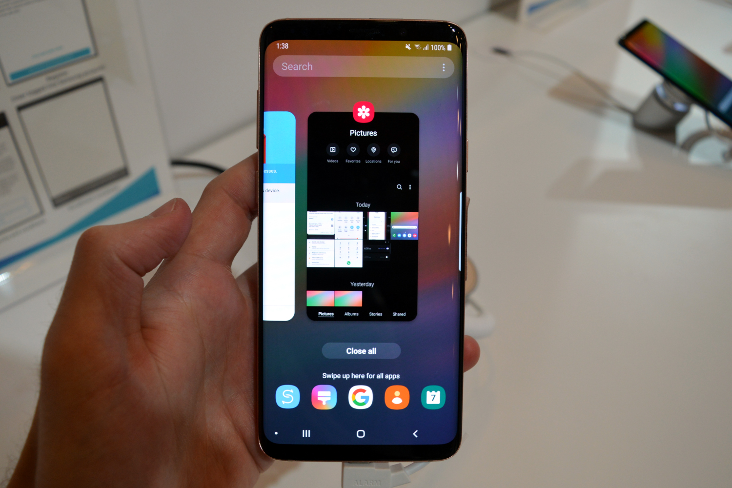
We were able to check out One UI for ourselves at the Samsung Developer Conference, and can confirm that the overall experience seemed very clean and stripped back. It’s not quite on the same level as stock Android — it still has Samsung apps and services — but compared to Samsung Experience, it’s much more basic, which is a good thing.
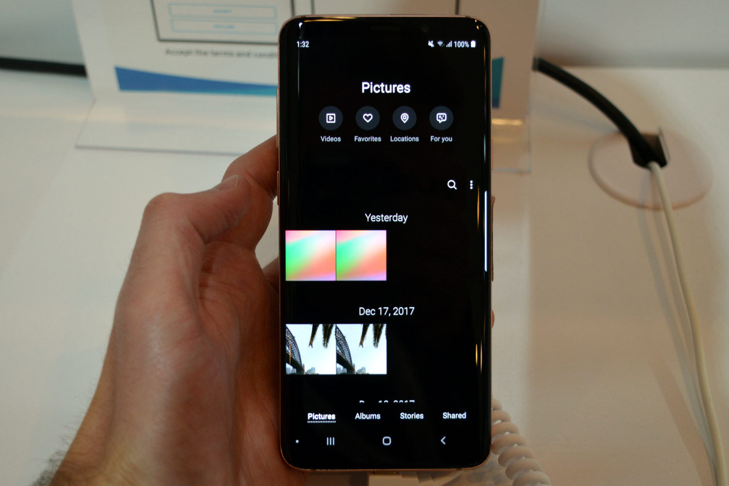
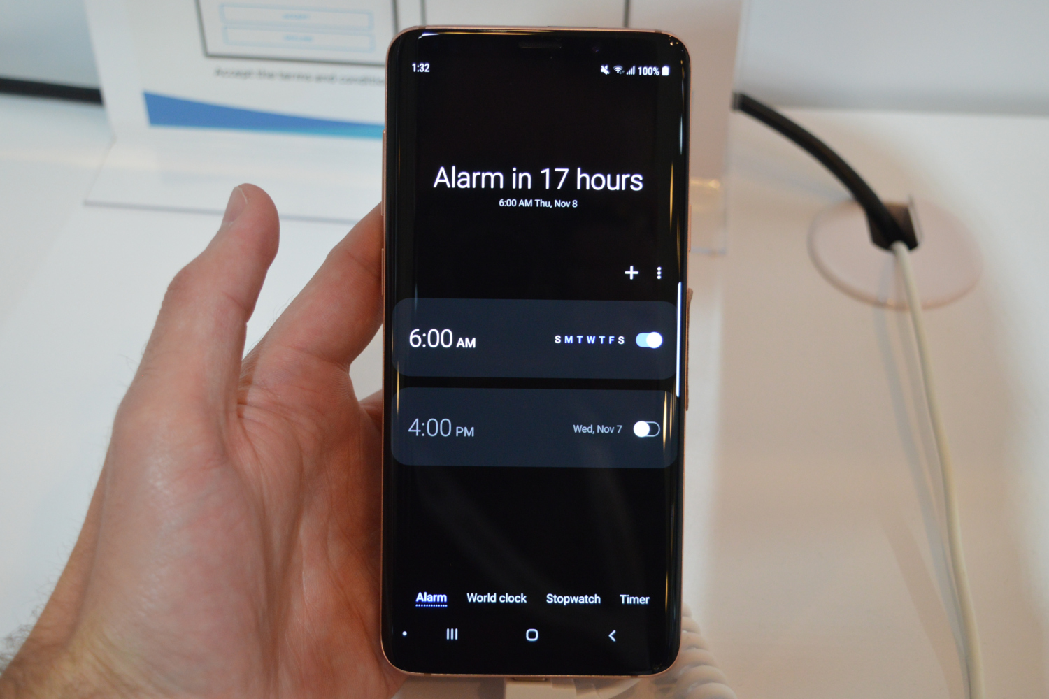
In One UI, Samsung seems to be prioritizing being able to use your phone with one hand. Most of Samsung’s apps had the majority of their controls at the bottom of the user interface, with other information — that you might not want or need to interact with — being found at the top. For example, when you open the Settings app, the top third of the interface simply says “Settings,” and offers a small button to activate search in the app. Scroll down, and the app will start to use that space — but the advantage is that it’s easy to tap a menu item with one hand. Other apps featured a similar layout, including the Clock app and Photos app.
We also saw a new “Dark Mode,” which gives apps a black background to make it easier to read elements on the screen in the dark without straining your eyes. Speaking of background colors, Samsung is also making the experience between software and hardware a little more uniform by color-matching aspects of the interface with the color of the phone itself. So, for example, if you buy a purple phone, you’ll find different purple user interface elements too.
Other changes to the software are less subtle. For example, in the Messages app the app will be split into two sections — a preview section and an “interaction area.” With these two sections, you’ll be able to select what messages you want to read, which will appear in the viewing area without opening a new screen.
While initially it wasn’t quite clear, Samsung confirmed to us that One UI is indeed aimed at being the successor to Samsung Experience, which is itself the successor to TouchWiz. It’s clear that Samsung has put a lot of work into creating a clean interface since the days of TouchWiz.
Samsung’s One UI will be available to the Galaxy S9, S9 Plus, and Note 9 in early January, and will presumably show up in Samsung’s other phones going forward. If you want to know more, you can also check our guide on how to uninstall Apps in your Andriod.


