“Sony just released the best Xperia phone to date”
- Speedy performance
- Clean and easy-to-use Android interface
- Cinema Pro offers cinematic video
- Excellent 4K display
- Tall screen size is unique and useful
- Battery life could be better
- Several software bugs and issues
- Camera falls short of the competition
- Screen is dim outdoors
Take the screen from your favorite cinema and miniaturize it so that it’s small enough to fit in a pocket. That’s the Sony Xperia 1, which may look like any other rectangular slab of a phone at first glance … but hold it and it feels like you’re carrying a mini home theater. It’s long, narrow, and has a dazzling 4K display that makes watching movies feel cinematic.
But as with all Sony phones, there’s quite a lot of baggage. Should you buy this $900 behemoth? It’s Sony’s best phone to date, but no. Is it worth paying attention to? Absolutely.
A cinematic viewing experience
What sets the Xperia 1 apart from the competition is its use of the 21:9 aspect ratio that movies are typically filmed in. That means you’re getting a tall and narrow screen, as opposed to traditional smartphones with a 16:9 or 18:9 aspect ratio, making them wider and a tad shorter. This isn’t the first time we’re seeing a 21:9 smartphone; LG’s New Chocolate smartphone from 2009 had one, and more recently, the Sony Xperia 10, Xperia 10 Plus, and Motorola One Vision all have 21:9 aspect ratios.
The Xperia 1 has the world’s first 4K HDR 21:9 OLED screen, though. It’s not true 4K as the screen resolution is 3,840 × 1,644 (rather than the typical 4K movie resolution of 3,840 × 2,160), but it’s still close enough to count.
The 6.5-inch screen is incredibly sharp, and support for HDR means when watching HDR content on HDR-supported apps, you get more accurate color profiles the content creator intended to use. And color is really where the Xperia 1 shines. Sony said the Xperia 1 attempts to “provide a faithful reproduction of the creator’s intended vision” by also matching color reproduction from reference monitors (with the DCI-P3 and BT.2020 color gamut and standard) — it’s what Apple’s $5,000 Pro Display XDR claims as well.
You need to toggle Creator Mode in Display settings for this to work, but when you do you’ll find natural and realistic colors in apps like Netflix; it’s not over-saturated like OLED screens on Samsung phones. Even better, there’s a tool to customize white balance to suit your liking. Watching 21:9 4K movies on Netflix is excellent, offering a truly immersive and cinematic experience, with wonderful colors.
But there are two problems. First, most of the content I watch on my phone is not shot in 21:9. YouTube videos and TV shows on Netflix are largely filmed in 16:9 or another aspect ratio, so you’ll have to deal with big black bars on the sides of the content. You can pinch in to make it fit the full-frame, but you’re cutting off the image and cropping in on the resolution. While I still preferred to pinch in, there are moments I pinched out as the screen cut off people’s faces in the shows I watched.
It’s powerful, speedy, and I had no trouble running the usual set of apps.
Second, the Xperia 1’s screen doesn’t get too bright. It’s readable outdoors when using the usual apps like Google Maps or Twitter, but I tried watching episodes of Stranger Things and Game of Thrones outdoors and it was near impossible to see darker scenes. I compared this to the Galaxy S10 Plus, which wasn’t perfect, but it was significantly easier to see the same scenes clearly. If you consume a lot of videos on the go outdoors, this is a reasonable deal breaker.
Paired with the cinematic screen experience are stereo speakers, and they get plenty loud — you won’t have trouble listening indoors and, provided you’re not right next to a construction site, outdoors as well. Turn on Dolby Atmos in the settings, because it drastically adds some punch to the audio quality, though the music still sounds a bit tinny and not as dynamic as the speakers on the Galaxy S10 Plus.

If you’re an audiophile, you’ll be happy to hear the Xperia 1 supports audio formats like LPCM, FLAC, and ALAC. There sadly is no headphone jack, so you’ll have to utilize Bluetooth earbuds. Thankfully, support for LDAC and Qualcomm’s AptX HD ensures high-quality audio comes through wirelessly. This type of audio support is only matched by LG phones, such as the LG G8 and the V50 ThinQ (which go a step further as they retain headphone jacks).
While I think the overall viewing experience here is a winner, the 21:9 screen and accurate color reproduction efforts are cater to a niche audience. Most people won’t be able to tell the difference between a 4K and 2K panel on a phone, and the superior brightness on phones like the Galaxy S10 detracts from the versatility of the Xperia 1.
Design: Like a remote control
Here’s one feature of the 21:9 aspect ratio that I love: The super-tall screen. It’s difficult to hold and appreciate an 18:9 phone, let alone a 16:9 phone after using the Xperia 1. It’s tall and looks like a TV remote, which means reaching the top of the screen can be a challenge, but it’s also narrow. That makes it significantly easier to wrap your palm around it, and I love it.
Rounded sides and corners make the phone comfortable to hold, a distinct departure from the more angular Sony phones of old. It looks modern and svelte, even if it doesn’t have the most bezel-less design.
It’s difficult to hold and appreciate an 18:9 phone, let alone a 16:9 phone after using the Xperia 1.
The right side are where you’ll find all the buttons, as well as the fingerprint sensor, and I have mixed feelings. I appreciate all the buttons being on a single side, but the power button is far too low for my taste. I have to shift my grip just to be able to tap it. Moving the volume rocker a little higher and squeezing the power button between it and the fingerprint sensor would have made a lot more sense.
The fingerprint sensor itself is quick to react, though it can occasionally mistake your palm as an attempt to use the sensor, and I’ve had it tell me “Too many attempts. Try again later,” which is annoying. There’s one more button further below: A dedicated camera button. Tap and hold it to launch the camera, and you can use it to start recording video or to snap a photo. I’ve always enjoyed dedicated camera buttons, so it’s appreciated here.
The back of the phone, like the front, is protected by Corning’s Gorilla Glass 6, and unsurprisingly, it’s a fingerprint magnet. Like my experience with almost all Sony phones, the Xperia 1 has a tendency to slide off tables and out of pockets when sitting, so a case may be a good idea to keep it protected.

There’s a triple-camera module here, and it doesn’t sit flush with the rear panel, but the phone doesn’t rock too much when using it on a flat table. The back of the phone continues that elegant theme, though I’d nab the phone in purple instead of the black color seen here. It makes the Xperia 1 stand out.
Strong performance
Sony’s Xperia 1 is powered by Qualcomm’s Snapdragon 855 processor — the same chip inside most flagship Android phones ranging from the Samsung Galaxy S10 to the OnePlus 7 Pro — and it’s paired with 6GB of RAM. It’s powerful, speedy, and I had no trouble running the usual set of apps.
Here are a few benchmark results:
- AnTuTu 3DBench:340,023
- Geekbench 4 CPU:3,499 single-core; 10,861 multi-core
- 3DMark Sling Shot Extreme:4,451 (Vulkan)
These scores are close to other Snapdragon 855 devices, but the Xperia 1 didn’t hit any records. Nevertheless, you won’t have a second thought on performance using this phone.
I did have a visual issue running games, though. No, they didn’t perform poorly or look terrible; they were playable, but the interface is cut off for most games due to the unusual aspect ratio of the phone. Not all games support a 21:9 phone, after all. The in-game map in PUBG: Mobile was cut off, so it wasn’t very helpful in gameplay; the title card in Alto’s Odyssey is slightly cropped in, though this didn’t affect the game; and Pako: Forever had a giant black bar at the bottom, which is likely what you’ll find with several games. It’s not completely like this, as titles like Asphalt 9 Legends didn’t have any trouble visually with the 21:9 screen.

There is a handy Game Enhancer app that launches a floating menu whenever you play a game, and it lets you choose a priority for battery life or performance, and also lets you customize the gaming experience by toggling things like Do Not Disturb mode on, for example.
Glitches with the software
The software experience is close to stock Android 9.0 Pie — a great move on Sony’s part, as the interface looks a lot cleaner (and the lack of a Sony skin likely uses fewer resources).
There are a few of Sony’s own apps and services available, one of which is SideSense. You can double tap your finger along the edges of the phone on the left and right side to launch SideSense, which opens a customizable tray of apps for quick access. You can also swipe your finger up or down on the bezel, and customize the action that follows. I’ve set a downward swipe to expand the notification drawer, and an upward swipe to open multitasking mode. It can be a little janky, but I found it useful.
Speaking of multitasking, the 21:9 screen is perfect for split-screen mode. Put one app on top of another, and you get enough screen space to see content from both. That being said, the Xperia 1 hasn’t managed to make me remember to utilize split-screen mode. The only phone that has managed that is the Samsung Galaxy Fold.
Every time I take it out of my pocket, it has managed to land in some deep system settings menu or an app
There are limitations to 21:9 screens, but it makes sense to use it with phones. Vertically-scrolling apps like Twitter and Instagram are superior, as you can see a lot more information without needing to scroll.
All this being said, I’ve run into my fair share of issues using the Xperia 1. I haven’t been able to enjoy Bluetooth music playback, as audio gets stuttery when the phone is in my pocket — so I need to hold it in my hand. The phone also constantly operates by itself when it sits in my pocket. I’ve opened it once and found it had tweeted on my behalf (nonsensical gibberish); every time I take it out of my pocket, it has managed to land in some deep system settings menu or an app. It even managed to turn the flash on, making me utterly perplexed when I looked down at my pants pocket to see a bright LED shining through.
Other issues include Instagram Stories being cut off due to the 21:9 aspect ratio, the camera app giving me an error (forcing a force close of the app), and music playback pausing when trying to snap a photo (update: this can be fixed if you turn off the camera shutter sound in the camera settings).
Some of these problems may mean there’s an issue with my unit, but I’ve reached out to Sony and they haven’t said much yet other than they are looking into it. These kinds of bugs make the phone feel not as polished, which should not at all be the case for anyone spending more than $900.
A capable camera that falls short
The trend with smartphone cameras these days is to include a triple-lens system. One high-quality standard lens, one telephoto for zooming in, and one wide angle for taking more in a single frame. It’s what’s on phones like the Galaxy S10 and Huawei P30 Pro, and the same is true on the Xperia 1. All the lenses have 12 megapixels; the standard uses an f/1.6 aperture with optical image stabilization (OIS); while the telephoto and wide-angle lenses use an f/2.4 aperture. The telephoto also has OIS, and sadly, the wide angle is a fixed-focus lens, which makes it a bit limiting.
The results from the Xperia 1 produce some of the most natural colors I’ve seen in photographs captured by a smartphone camera, akin to the results on the Nokia 9 PureView, and that is this phone’s strength. Detail is strong in good lighting conditions with the main lens, though it tends to deteriorate in lesser light — especially with the other two lenses.
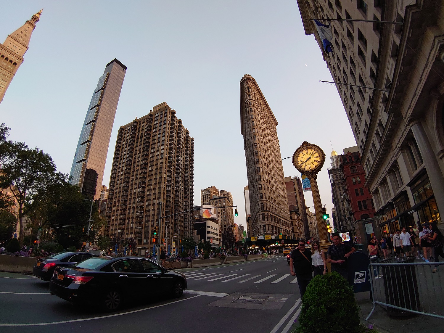
In high-contrast scenarios, the Xperia 1’s HDR doesn’t work as well as other smartphone cameras. The darker scenes are far too underexposed (far more than real life), and the photograph of the Flatiron building is a good example showing this. When scenes are bright, the camera often overexposes these areas, and the image of my girlfriend sitting on an outdoor bench showcases this as well.
- 1. Xperia 1, telephoto lens.
- 2. Pixel 3, digital zoom.
I like the versatility the telephoto and wide-angle lenses bring, though there’s a little too much distortion on the latter lens (a setting lets you prioritize distortion, and while it helps a bit, it’s still not perfect, and image quality deteriorates). Results from the telephoto lens can be a little too soft at times.
I’ve found autofocus to be slow, especially in low light, and I frequently found myself waiting for the camera to get the focus right to snap a shot. It’s also not the fastest camera all around. In the end, I’ve found most photos require a bit of editing to look good.
That’s not to say I haven’t been impressed with some of the results. I love the shot of the pink rose, as the natural bokeh effect looks stunning. I also can’t stop staring at the image of the church with the orange and blue sky in the background. It’s fantastic. It’s unfortunate the results are not consistently this good.
The Portrait Mode is … well, let’s just say you should avoid it. Photos do not retain a lot of detail, and the blur effect makes the outline of the subject look soft, and not defined. The blur accuracy is not great, and the whole feature barely works in low light.

One area where the Xperia 1 shines is videography, but not with the main video section in the camera app. There’s a separate app called Cinema Pro (yes, it’s confusing), but this lets you capture 21:9 cinematic clips in 4K and HDR. It even supports Eye Autofocus, and you can customize exactly how you want the video to look. It requires a bit of technical know-how, though.
Using the manual focus is also tricky, and you’ll want to do lots of practice to get the shots you want. You’ll also benefit from using a smartphone gimbal, as Cinema Pro doesn’t seem to offer any image stabilization. But colors are fantastic when the video is viewed on a high-quality monitor, and it looks sharp. I wouldn’t use it much in low light, as the quality goes down quick.
There’s an 8-megapixel selfie camera on the Xperia 1, and it’s nothing to write home about. Images look good in strong lighting, but can be grainy in low light. It also tends to have issues in high-contrast scenarios.
Yes, you can take better pictures with the manual mode on the Xperia 1 — that applies for almost any phone that has such a mode. But a large number of people don’t do that or aren’t interested in trying it out. It’s why we focused on the auto mode specifically in our test.
Small battery capacity
Despite being such a long phone, the Xperia 1 has a disappointing small battery capacity: 3,300mAh. With light to medium use on a work day, I’ve been able to return home around 6 p.m. with 30% left in the tank. Push the phone a little harder, and you will likely have to juice it up before the night runs out.
The Xperia 1’s screen doesn’t get too bright.
The phone never died on me, but it came dangerously close. On days I stayed out longer (with heavier use), I’d arrive home around 9 p.m. with 15% left. It barely offers a full day, and that’s not great for a phone costing close to $1,000. Don’t get me wrong, the Xperia 1 does really well with what it has inside thanks to battery optimizations, but the phone should have close to a 4,000mAh battery inside.
In our battery test, where we play a YouTube 1080p video over Wi-Fi with the brightness set to the max, the Xperia 1 performed poorly against the competition: It only lasted 7 hours and 10 minutes. The Galaxy S10 Plus lasted 12 hours and 40 minutes, and the LG V50 ThinQ managed 10 hours and 30 minutes.
It’s fast to recharge, nabbing around 50% in 30 minutes of a charge with the included charger, but it’s a shame there’s no wireless charging available. Almost every flagship phone has this as a standard feature and it genuinely adds convenience, especially on phones that can’t ensure a full day of use.
Price, availability, and warranty information
The Sony Xperia 1 is available from Amazon, Best Buy, and B&H Photo, and other retailers. It costs $900 and comes with 128GB of internal storage (a MicroSD card slot is present).
Sony offers a standard limited warranty that covers the phone from manufacturer defects for one year from the date of purchase.
Our Take
Sony’s Xperia 1 is the best Xperia phone to date. But while the cinematic screen is a treat, battery life and the camera could be better, and that’s without mentioning all the quirks with the software. At $950, it’s priced too high, because there are better phones available.
Is there a better alternative?
Easily. If you’re looking for an enriched viewing experience, the Samsung Galaxy S10 Plus is your best bet. It has an excellent AMOLED screen that may spruce up the colors, but it gets fantastically bright. The iPhone XS Max should also be considered. If you can’t do without a 4K 21:9 screen, then the Xperia 1 is your only choice.
If you want the best camera experience, you can get good results with the S10 camera as well, and for videography you’ll have a better time with the iPhone. But the Pixel 3 XL should be given a look as it has the best camera you can buy on a phone.
Of course, the recently released iPhone 11 will attract many buyers, and for good reason. At a starting price of $700, it’s a much better value.
Check out our best smartphones guide for more.
How long will it last?
The Xperia 1 is covered in glass, so buy a case to keep it protected from accidental drops. It’s thankfully IP65/68 water-resistant, so it can handle itself against some water.
Sony does a solid job of updating its phones to the latest software quickly, so you can be sure the Xperia 1 will get Android 10 Q a few months after Google releases it.
Should you buy it?
No. I’ve had a largely pleasurable experience with the Xperia 1 — it’s by no means a “bad” phone — but there are quite a few shortcomings to warrant its $900 price tag.
If you’re a Sony enthusiast, then you’re likely going to buy the Xperia 1 no matter what — and that’s fine. You’ll enjoy your time with the phone, as I have, but I do think it may be worth waiting for a price drop in the coming months.


