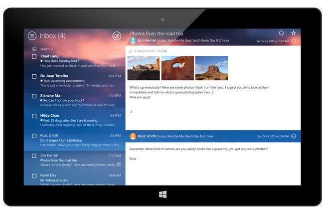
Last week, Yahoo Mail turned 16, and in a celebratory move, the constantly-revamping Yahoo announced an inbox redesign. In case Gmail made you completely forget that you once had a Yahoo Mail account, here’s what it looks like now:

Your eyes aren’t playing tricks on you – the new Yahoo Mail is a slick, pretty clone of Gmail now, and while you might think this decision to shadow its more popular competitor is a great strategic move on Yahoo’s part, the truth is, users are far from impressed.
Yahoo’s user feedback forum is already teeming with Yahoo Mail-related rants after only being available for less than a week. Here are some of Yahoo Mail’s previous features users found extremely essential that vanished with the redesign (or are hidden away in some cobwebby corner of the email service):
Tabs. Tabs have been eradicated from Yahoo Mail, something that power users are particularly upset about. “There is a reason those in this forum use Yahoo and not Gmail. It is based on a difference in thinking how best to design webmail for both the casual and power user. Please, please bring back Tabs or allow Power users to use the old version that allowed for multiple tabs open at once. This is a major issue that determines the usability of the product,” one displeased user says.
‘Sort by sender’ option. Instead of being able to quickly click on your inbox’s header to arrange your messages for easier filing, Yahoo says you can turn off an option called Conversation Threading. While Gmail aficionados are used to this method of message grouping, Yahoo Mail regulars will definitely feel the glitch to their email-reading habits. According to Yahoo, this is available as a “quick action that appears on hover (as a magnifying glass) and is available on a per message basis.”
Quick folder view. The new design apparently took away the user’s power to multi-task between inbox and folders – in order to view messages, you have to exit one to get to the other. Yahoo also responded to this particular gripe, saying new emails are highlighted with a color ball to the left that can be toggled as read or unread and that it’s more efficient than before.
These functions are basically taken from Gmail’s playbook, which shouldn’t be a complete surprise – Yahoo’s CEO Marissa Mayer used to work for Google, after all. The current redesign of Yahoo Mail is the company’s second attempt at improving the mail’s web experience under Mayer’s tutelage, and both efforts at regaining their userbase’s trust have been lackluster, with Yahoo Mail diehards still complaining about the same issues they brought up last December, when the company first edged the email client into Gmail territory.
Additionally, complaints on accessibility have risen to almost 9,000 comments, while bug or error reports are over 6,000. The most repetitive plea on all three pages? “We want the old version back!” Clearly, if they wanted Gmail, users would be on Gmail, not Yahoo Mail.
In response to the outrage, Yahoo sent us the following response:
“We deeply value how much our users care about Yahoo and are constantly engaging with our products. We recently made some design changes to Yahoo Mail. These changes are an important step to building a more modern and personalized Yahoo!. We recognize that this is a lot of change and are listening to all of the community feedback. Additionally, we’re actively measuring user feedback so we can continuously make improvements.”
Really, all of this could have been solved with a thorough blog post detailing the new functions and how they work – as well as where replacements for now-dead actions could be found. While that wouldn’t quell all user rage (there’s always someone whose ire cannot be placated), it would likely have eased some of what Yahoo’s left to deal with.


